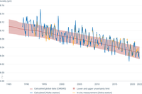
Aloha station: a decline in pH corresponds to an increase in the acidity of ocean water. Changes here are similar to those that are observed over a shorter time frame in Europe. In figure, "In situ measurement (Aloha station)" corresponds to data based on in-situ measurements, while "Calculated (Aloha station)" corresponds to calculated data. Data originate from the Aloha station pH time series (adapted from Dore, J.E., R. Lukas, D.W. Sadler, M.J. Church, and D.M. Karl. 2009. Physical and biogeochemical modulation of ocean acidification in the central North Pacific. Proc Natl Acad Sci USA 106:12235-12240).
CMEMS: global average of surface ocean pH from the Copernicus Marine Service, based on a reconstruction method using in situ data and remote sensing data, as well as empirical relationships. Indicator is available at annual resolution, and from the year 1985 onwards, up to 2022. Error on each yearly value varies, and is added in the data file sheet. Trend and uncertainty are defined as the slope and its residual standard deviation estimated with a linear least-squares regression.

The different sea regions are presented in the Y axis. The X axis corresponds to the number of time series with statistically significant decreasing trends (green), increasing trends (orange) and no trends (grey). Statistical significance at p<0.05.
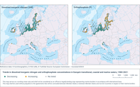
Trends in concentrations of nitrogen (dissolved inorganic nitrogen—DIN) and phosphorus (orthophosphate) in the upper 10m of the water column in European seas during the season of low phytoplankton growth (SLPG) are shown for the period 1980-2021. Green circles indicate stations with significant (p<0.05) decreasing trends; orange circles show stations with significant (p<0.05) increasing trends; and grey circles show stations with no significant trends. In these cases, p is a statistical term describing the probability that the trend is significant.
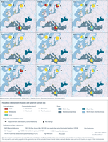
There is one map for each of the contaminants measured in mussels and oysters, which are representative of the hazardous substances in marine organisms. In the map, each of the small dots represents a station (a location which is regularly monitored), coloured according to estimated concentration levels (low/moderate/high relative to environmental thresholds). The big pie diagrams show, for each region, the proportion of stations that have low/moderate/high concentration levels. The arrow by each pie diagram shows whether concentrations are in general improving (decreasing concentrations) or show no significant change. There were no cases of increasing trends.

Left graph:
A decline in pH corresponds to an increase in the acidity of ocean water.
Data originate from the Aloha station pH time series (adapted from Dore, J.E., et al., 2009, 'Physical and biogeochemical modulation of ocean acidification in the central North Pacific', Proceedings of the National Academy of Sciences of the United States of America 106:12235-12240).
Changes here are similar to those that are observed over a shorter time frame in Europe (see here: http://www.climatechange2013.org/images/figures/WGI_AR5_Fig3-18.jpg).
In figure, "In situ measurement (Aloha station)" corresponds to data based on in-situ measurements, while "Calculated (Aloha station)" corresponds to calculated data.
Global annual average of surface ocean pH from the Copernicus Marine Service, based on a reconstruction method using in situ data and remote sensing data, as well as empirical relationships. Indicator is available at annual resolution, and from the year 1985 onwards. The error on each yearly value varies, and is added to the data file sheet. The estimated yearly uncertainty envelope shown in the figure is defined as the annual mean of pH ± 2 standard deviations, which corresponds to a 95% confidence interval of the mean estimate.
Right graph:
Time series (1870-2022) of decadal average observed sea surface temperature anomalies (°C), with respect to the period 1991-2020, for each of the European basins, for the European seas as a whole, and for the global ocean. Data sources: HadSST4.0.1.0 (1850-2022), ERSSTTv5 (1880-2022), HadISST1 (1870-2022) and satellite-based ESA CCI/C3S SST Climate Data Record v2.1 (1991-2022).

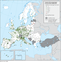
The map shows trend analysis considering NO2 annual mean observations at monitoring sites. The coloured squares represent stations with "significant" trends, while the black dots represent stations with “non-significant” trends.

The map shows trend analysis considering the ozone indicator AOT40 for vegetation calculated at monitoring sites. The coloured squares represent stations with "significant" trends, while the black dots represent stations with “non-significant” trends
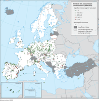
The map shows trend analysis considering SO2 annual mean observations at monitoring sites. The coloured squares represent stations with "significant" trends, while the black dots represent stations with “non-significant” trends.

The map shows trend analysis considering 99.8 percentile (p99.8) of the NO2 hourly concentrations at monitoring sites. The coloured squares represent stations with "significant" trends, while the black dots represent stations with “non-significant” trends.
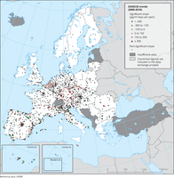
The map shows trend analysis considering the ozone indicator SOMO35 calculated at monitoring sites. The coloured squares represent stations with "significant" trends, while the black dots represent stations with “non-significant” trends.
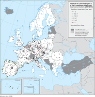
The map shows trend analysis considering the 93.2 percentile of O3 maximum daily 8-hour concentrations at monitoring sites. The coloured squares represent stations with "significant" trends, while the black dots represent stations with “non-significant” trends
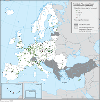
The map shows trend analysis considering PM2.5 annual mean observations at monitoring sites. The coloured squares represent stations with "significant" trends, while the black dots represent stations with “non-significant” trends.
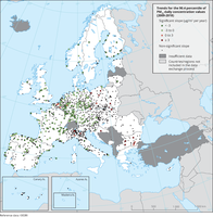
The map shows trend analysis considering the 90.4 percentile of PM10 daily observations at monitoring sites. The coloured squares represent stations with "significant" trends, while the black dots represent stations with “non-significant” trends
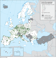
The map shows trend analysis considering PM10 annual mean observations at monitoring sites. The coloured squares represent stations with "significant" trends, while the black dots represent stations with “non-significant” trends.
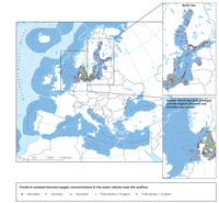
The map shows trends per station in dissolved oxygen concentrations in the water column near the seafloor, observed in summer/autumn of the years 1990-2017. Purple: significant decrease; green: significant increase; grey: no significant trend. Small symbols: ≤10 years of data; large symbols: >10 years of data.
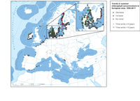
The map shows trends per station in chlorophyll concentrations per station in the upper 10 m of the water column, as observed during summer in the years 1990-2017.
Red: significant increase;
Green: significant decrease;
Grey: no significant trend.
Small symbols: ≤10 years of data;
Large symbols: >10 years of data.
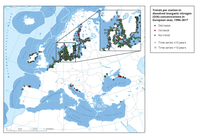
The map shows trends per station in dissolved inorganic nitrogen (DIN) concentrations in the upper 10 m of the water column, observed in European Seas during winter time during the period 1990-2017.
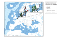
The map shows trends per station in total nitrogen concentrations in the upper 10 m of the water column, observed during the years 1990-2017.
Document Actions
Share with others