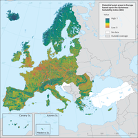
The quietness suitability index (QSI) provides the overview with the highest (QSI=1) and lowest (QSI=0) proportion of potential quiet areas in Europe.

The table shows the countries' reporting performance on the basis of Eionet Core Data Flows since 2005

Additional number of days per year with high-to-extreme fire danger by weather (daily Fire Weather Index≥30), compared with the situation in the reference time period 1981-2010, for different levels of global warming. Median ensemble of five model-statistics (see recommended References).

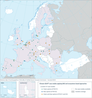
The figure shows a snapshot of the coverage of Climate-ADAPT case studies with 123 case studies in total (The case studies collected at national level, provided by AdapteCCA.es, where removed from the list of case studies (value 10)) by March 2024.

The figure shows a snapshot of the number of case studies per policy sectors by March 2024.

The figure shows a snapshot of the number of case studies that implement Climate-ADAPT adaptation options (58 in total, see here: https://climate-adapt.eea.europa.eu/en/knowledge/adaptation-information/adaptation-options) for each of the five risk clusters of the European Climate-Risk Assessment by March 2024.

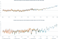
Above chart: Global annual averages of near-surface temperature of land and ocean expressed as the anomaly relative to the pre-industrial period 1850-1900 according to the datasets used by the Copernicus Climate Change Service (C3S): ERA5 (C3S/ECMWF), JRA-55 (JMA), GISTEMPv4 (NASA), HadCRUT5 (Met Office Hadley Centre), NOAAGlobalTempv6 (NOAA) and Berkeley Earth.
Below chart: European annual averages of near-surface temperature expressed as the anomaly relative to the pre-industrial period 1850-1900 according to the datasets used by the Copernicus Climate Change Service (C3S): ERA5 (C3S/ECMWF), JRA-55 (JMA), GISTEMPv4 (NASA), HadCRUT5 (Met Office Hadley Centre), NOAAGlobalTempv6 (NOAA) and Berkeley Earth.

Left panel:
Observed temperature trend from stations available in the European Climate Assessment and Datasets (ECA&D) (with different lengths of records) for daily temperature.
Right panel:
- Left map: Projected temperature change between the WMO reference period 1981-2010 and the end of the 21st century (period 2081-2100) under the scenario SSP1-2.6.
- Right map: Projected temperature change between the WMO reference period 1981-2010 and the end of the 21st century (period 2081-2100) under the scenario SSP5-8.5.

The figure shows the gross value added generated by the environmental goods and services sector, broken down by classification, along with the share of gross domestic product, at the EU-27 level from 2010-2021.

The figure shows employment in the environmental goods and services sector for the EU-27, split based on the largest classifications, along with what share of total employment this represents. Data is shown for 2010-2021.

The figure shows employment in the environmental goods and services sector as a share of total employment. Data is shown for 2014 and 2021, in the EU-27 and member states

The map shows all EEA Member countries that provide online catalogues of case studies on adaptation to climate change.

The figure shows the trend of emissions into air of dust, NOₓ (Nitrogen Oxides) and SO₂ (Sulphur dioxide) from Large Combustion Plants (LCP) in the EU-27.

The figure shows the fuel consumption trends from Large Combustion Plants (LCP) in the EU-27.

The figure shows the trend of pollutant releases into air in the EU-27 from 2010 to 2022 by using 2010 releases values as reference. In addition, gross value added (GVA) from the industry sector is presented.

The table shows the changes in pollutant releases in EU-27 Member States from 2010 to 2022
Document Actions
Share with others