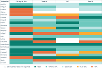
The table show the top five emission reduction changes in pollutant releases into water in EU-27 Member States from 2010 to 2022.
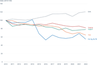
The figure shows the trend of pollutant releases into water in the EU-27 from 2010 to 2022 by using 2010 releases values as reference. In addition, gross value added (GVA) from the industry sector is presented.
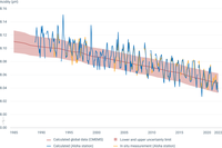
Aloha station: a decline in pH corresponds to an increase in the acidity of ocean water. Changes here are similar to those that are observed over a shorter time frame in Europe. In figure, "In situ measurement (Aloha station)" corresponds to data based on in-situ measurements, while "Calculated (Aloha station)" corresponds to calculated data. Data originate from the Aloha station pH time series (adapted from Dore, J.E., R. Lukas, D.W. Sadler, M.J. Church, and D.M. Karl. 2009. Physical and biogeochemical modulation of ocean acidification in the central North Pacific. Proc Natl Acad Sci USA 106:12235-12240).
CMEMS: global average of surface ocean pH from the Copernicus Marine Service, based on a reconstruction method using in situ data and remote sensing data, as well as empirical relationships. Indicator is available at annual resolution, and from the year 1985 onwards, up to 2022. Error on each yearly value varies, and is added in the data file sheet. Trend and uncertainty are defined as the slope and its residual standard deviation estimated with a linear least-squares regression.

The figure shows the share of bathing water quality classes by type and bathing season.

The figure shows the share of bathing water quality classes by country for the season of 2023.

Amounts of separately collected textile waste from economic activities and households were obtained from Eurostat’s ENV_WASGEN dataset. The amounts of textile waste in mixed municipal waste are estimations based on waste composition analyses (WCAs) and calculated on the mixed municipal waste from household and similar sources. As there is no harmonised method for the WCA throughout Europe, caution should be taken when interpreting these numbers. No data available on textiles in mixed municipal waste for Türkiye. Note that, due to a lack of capacity, Ireland and Norway were not able to verify these data. Therefore data are calculated based on the residual waste composition provided in EEA’s Early Warning assessment (EEA, 2022). Italy indicated that the amount from economic activities is an overestimation as this includes non-textile waste like scraps from leather manufacturing or secondary textile waste.

The different sea regions are presented in the Y axis. The X axis corresponds to the number of time series with statistically significant decreasing trends (green), increasing trends (orange) and no trends (grey). Statistical significance at p<0.05.
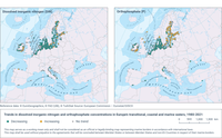
Trends in concentrations of nitrogen (dissolved inorganic nitrogen—DIN) and phosphorus (orthophosphate) in the upper 10m of the water column in European seas during the season of low phytoplankton growth (SLPG) are shown for the period 1980-2021. Green circles indicate stations with significant (p<0.05) decreasing trends; orange circles show stations with significant (p<0.05) increasing trends; and grey circles show stations with no significant trends. In these cases, p is a statistical term describing the probability that the trend is significant.
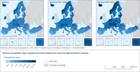
The maps shows the number of days in a year with daily total precipitation exceeding the 95th percentile threshold of rainy days of a reference period 1981-2010. Projections are made under the RCP 8.5 scenario. Interactive maps and additional information can be found in the European Climate Data Explorer.
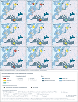
There is one map for each of the contaminants measured in mussels and oysters, which are representative of the hazardous substances in marine organisms. In the map, each of the small dots represents a station (a location which is regularly monitored), coloured according to estimated concentration levels (low/moderate/high relative to environmental thresholds). The big pie diagrams show, for each region, the proportion of stations that have low/moderate/high concentration levels. The arrow by each pie diagram shows whether concentrations are in general improving (decreasing concentrations) or show no significant change. There were no cases of increasing trends.
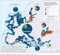
Observations are aggregated at the level of 100*100 km grid cells, and show the mean 25-percentile of dissolved oxygen (DO) concentrations subdivided in four classes (<2 mg/l, 2-4 mg/l, 4-6 mg/l, >6 mg/l). The pie charts indicate the relative spatial coverage of areas with the four different concentrations of DO, aggregated by Marine Strategy Framework Directive (MSFD) marine regions - North-East Atlantic Ocean, Baltic Sea, Mediterranean Sea and Black Sea (smaller pie charts) and for all regions combined (large pie chart in centre). Oxygen concentrations above 6mg/l are considered to support marine life with minimal problems while concentrations less than 2mg/l (hypoxia, oxygen deficiency) are considered to cause severe problems.

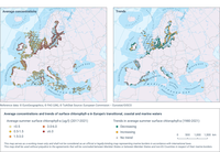
Average summer surface chlorophyll-a concentration (left) and trends (right), in locations recently updated (last update>2016) with at least 5 years of observations, in the period between 1980 and 2021. Green circles indicate stations with significant (p<0.05) decreasing trends (i.e., improving); orange circles show stations with significant (p<0.05) increasing trends (i.e., deteriorating); and grey circles show stations with no significant trends. Colour keys of symbols and values are included in the legend.

The figure shows the share of animals (expressed in livestock units, or LU) for which EU Member States have planned interventions supported under the common agricultural policy (CAP) and related to the prevention or reduction of antimicrobial use over the implementing period 2023-2027. The types of intervention that may be concerned include (a) sectoral types of intervention; (b) investments; (c) environmental, climate-related and other management commitments; and (d) schemes for the climate, the environment and animal health.
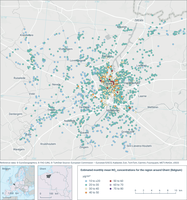
The map shows the average monthly mean NO₂ concentration, an indicator of local air quality. The data was derived from citizen reporting through the Curieuzeneuzen project.
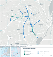
The map shows the planned interventions along the Harrestrup Brook to ensure sufficient capacity to reduce the impacts of flooding on the neighbouring residential areas
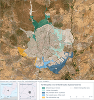
The dataset gives the location and extent of planned forest lots around the city of Madrid under the municipal plan 'Madrid 360'
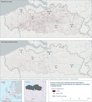
The map shows the new soil sealing in 2050 following the scenarios and gives a share of 0 to 100% sealing per rastercell of 1ha.