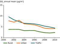
All stations in EU Member States, with at least 75 % data coverage for at least eight years were included in the analysis. Concentrations per station type are given in μg/m3. In the diagram a geographical bias exists towards central Europe where there is a higher density of stations.
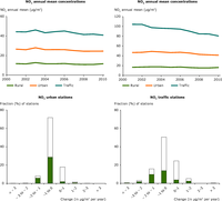
All stations in EU Member States, with at least 75 % data coverage for at least eight years were included in the analysis. Concentrations per station type are given in μg/m3. In the top two diagrams a geographical bias exists towards central Europe where there is a higher density of stations.
In the percentage frequency distribution graphs, closed bars denote stations showing a statistically significant trend, open bars denote stations with a non-significant trend. Statistically significant trends (level of significance 0.1) are calculated by applying the Mann-Kendall test. The applied method is described in de Leeuw, 2012.
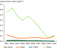
-
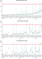
The graphs are based on the 99.2 percentile of daily mean concentration values corresponding to the 4th highest daily mean; they present the range of concentrations at all station types (in μg/m3) officially reported by the EU Member States and how the concentrations relate to the limit value set by EU legislation (marked by the red line).
The diagram indicates the lowest and highest observations, the means and the lower and upper quartiles. The lower quartile splits the lowest 25 % of the data and the upper quartile splits the highest 25 % of the data.
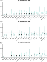
The graphs are based on the annual mean concentration values; they present the range of concentrations at all station types (in μg/m3) officially reported by the EU Member States and how the concentrations relate to the limit value set by EU legislation (marked by the red line).
The diagram indicates the lowest and highest observations, the means and the lower and upper quartiles. The lower quartile splits the lowest 25 % of the data and the upper quartile splits the highest 25 % of the data.

All stations in EU Member States, with at least 75 % data coverage for at least eight years were included in the analysis. Concentrations per station type are given in μg/m3. In the diagrams a geographical bias exists towards central Europe where there is a higher density of stations.
The 93.2 percentile of daily max 8-h mean values is directly related to the target value for O3, as 25 days per year are allowed to have exceedances of the target value threshold of 120 μg/m3.
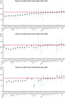
The graphs are based on the 93.2 percentile of maximum daily 8 hours mean concentration values corresponding to the 26th highest daily maximum of the running 8h-mean; they present the range of concentrations at all station types (in μg/m3) officially reported by the EU Member States and how the concentrations relate to the target value set by EU legislation (marked by the red line).
The diagram indicates the lowest and highest observations, the means and the lower and upper quartiles. The lower quartile splits the lowest 25 % of the data and the upper quartile splits the highest 25 % of the data.
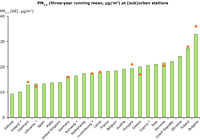
The three-year running mean of PM2.5 concentrations (2008–2010) is similar to the method used to calculate the average exposure indicator. Compiled data reflects background (non-traffic and non-industrial) urban and suburban stations.
Results for countries marked with an asterisk are based on less than three years of data.
The orange dots correspond to figures provided by the EU Member States in the air quality questionnaire.

All stations in EU Member States, with at least 75 % data coverage for at least eight years (PM10) or six years (PM2.5), were included in the analysis. Concentrations per station type are given in μg/m3. In the diagrams a geographical bias exists towards central Europe where there is a higher density of stations.

The graphs are based on the annual mean concentration values; they present the range of concentrations at all station types (in μg/m3) officially reported by the EU Member States and how the concentrations relate to the target value set by EU legislation (marked by the red line).
The diagram indicates the lowest and highest observations, the means and the lower and upper quartiles. The lower quartile splits the lowest 25 % of the data and the upper quartile splits the highest 25 % of the data.
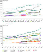
This figure shows the material productivity (GDP per tonnes DMC) for selected EU27 countries and selected other countries in 1980 (1992) and 2009 (2008).
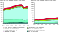
This figure shows 1999-2011 direct imports and exports by eight product groups of the EU27 in million tonnes

This figure shows the development of labour productivity, energy productivity and materials productivity in the EU
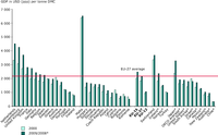
This figure shows the material productivity (GDP in millions of 2011 US$ (converted to 2011 price level with updated 2005 EKS PPPs) per tonnes DMC) for the EU27 member states and selected other countries in 2000 and 2009 respectively 2008.
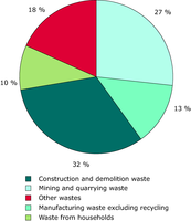
This figure shows the total waste generation distribution in percentages between different sources in the EU, EFTA, Croatia and Turkey in 2008

This figure shows the development in unit price on a monthly basis of plastic, paper and glass waste from January 2000 to December 2011. The prices are calculated as weighted averages of a number of sub waste fractions for export both within and out of the EU.
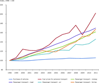
A time series for transport related prices using as index year 1998
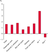
The Figure is showing average annual growth rates of different means of transport within the EU-27 in the period between 1995-2008. (Actual yearly growth rates are of course differing from the averages used in the figure) The values for Air and Sea travel only include domestic and Intra-EU-27 transport. Most numbers are based on estimates and data for Air and Sea are provisional estimates.
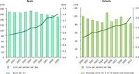
(left) The graph shows the development of average prices for drinking water supply and water consumption of households in Spain.
(right) The graph shows the development of average prices for water supply for human consumption in Estonia.
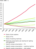
A time series of the available stock of three household appliances in EU27 compared to the specific energy consumption of those appliances and the total electricity consumption of households