
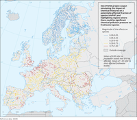
This map shows a mixture toxicity metric called multi-substance Potentially Affected Fraction of species (msPAF). For individual substances, the Potentially Affected Fraction of species (PAF) is derived from the results from laboratory toxicity tests, as the fraction of the tested species that would show effects if a laboratory test would be performed with a given concentration of the chemical. To this end, the results from laboratory tests have been converted beforehand into a species sensitivity distribution (SSD). The individual PAFs are then combined into an msPAF using the dose-addition principle. For this map, toxicity tests have been used that seek to quantify the no-observed-effect concentration (NOEC). The use of this endpoint links the result to the regulatory concept of “sufficient protection” of aquatic ecosystems. The above has been applied to the simulated concentrations of 1,785 chemicals on 365 consecutive days, and the 95 percentile of the results per site have been mapped.
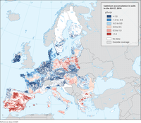
Cadmium (Cd) in agricultural top soils (upper 20 cm)
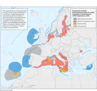
The map gives and overview of the Marine Strategy Framework Directive (MSFD) Regions and Subregions that achieved a good environmental status (GES) for Descriptor 8, feature Contaminants (UPBT substances), resulting from the 2018 Marine Strategy Framework Directive (MSFD) Art. 8 reporting exercise. The map is extracted from the "2018 reporting of MSFD Article 8 – assessment of good environmental status (GES) per country or marine region/subregion" dashboard, excluding the seabed only areas (marine areas extending over 200nm from the coastline)
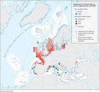
The map shows the results of a preliminary classification and identification of ‘non-problem areas’ and ‘potential problem areas’ with respect to marine litter in Europe’s Seas, using the prototype Marine Litter Assessment Tool (MALT), a multi-metric indicator-based status assessment tool. Please see the European Topic Centre (ETC) report "Marine Litter in Europe - An integrated assessment from source to sea".
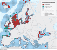
The map shows the results of classification of Contamination Status using the CHASE+tool. The contamination status is classified as ‘non-problem areas’ or ‘problem areas’.
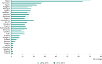
The figure shows the percentage of groundwater stations in each EU country and the EU level, exceeding the drinking water standard (50 mg of nitrates per litre) during the last two reporting periods under the Nitrates Directive

The figure shows aggregated time series for monitoring sites (surface waters) or water bodies (groundwater). Only complete time series are included. The selected time series are aggregated by averaging across all sites for each year.

Results of classification of Eutrophication Status using the HEAT+ tool. Eutrophication status is evaluated in five classes, where NPAhigh and NPAgood are recognised as ‘non-problem areas’ and PAmoderate, PApoor and PAbad are recognised as ‘problem areas’.

The figure shows the 100-year Global Warming Potential (GWPs) of CH₄ from the Intergovernmental Panel for Climate Change (IPCC) Assessment Report 2, 4 and 5 (AR2, AR4, AR5), together with the AR5’s 20-year GWP. The 100-year values are used to allow comparison with other greenhouse gases (GHGs) reported in the inventories and have been agreed by the Parties for reporting under the United Nations Framework Convention on Climate Change (UNFCCC), the Kyoto Protocol and the Paris Agreement.
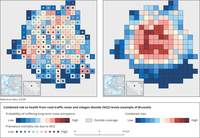
The map presents the combined risk to health from road traffic noise and fine particulate matter (PM2.5)/ Nitrogen dioxide (NO2) levels. The white areas show an average combined risk across the cities included in this tool. In the blue areas, the combined risks are lower, while in the orange and red areas the combined risks are higher. Using this map, citizens can better understand the environmental quality of their neighborhoods.

This shows the geometric mean (normalised to 1986) levels of Perfluorooctane sulfonic acid (PFOS) and Perfluorooctanoic acid (PFOA) in human subjects.
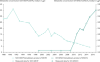
The charts show the levels of two different chemicals in the human body. One is banned now (DEHP) and the other was introduced as a substitute.
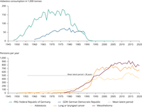
This chart shows the use of asbestos in Germany and also the associated health impacts which tend to happen several decades after initial exposure.
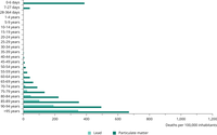
This is based on data taken from the Institute for Health Metrics and Evaluation (IHME) database which models health impacts based on exposure to a range of environmental risk factors. In this case we look at air pollution and lead.

The figure shows the variation in CO₂ concentrations in a school classroom over the course of a week.
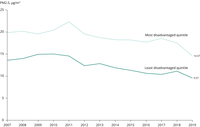
The graph represents the trend of annual average annual concentrations of particles of a diameter of less than 2.5 microns in ambient air concentration, weighted by population, by year and for the entire EU, for the richest quintile (top 20% in terms of GDP, gross domestic product, per capita) and the poorest quintile (bottom 20% in terms of GDP per capita). In the graph, one can see that both the richest regions and the poorest regions in the EU are improving their air quality (i.e. PM₂.₅ concentrations are decreasing), but the richest are doing so from lower starting levels and significantly faster than the poorest.
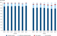
The figure shows the share of bathing water quality classes by year.

The diagram presents the percentage of samples from the most commonly-consumed food groups in Europe that were compliant with pesticide residues below or equal to the legal limit, higher than the legal limit or non-compliant.