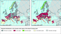
This figure shows the future distribution of climate niche space of the Small Tortoise shell (Aglais urticae) under the A2 climate change scenario and two future time periods (2021-2050 left, 2051-2080 right). Dark grey areas show space that remains suitable, magenta areas space that is lost and green areas show space that could be gained under full dispersal. Northern parts of Europe are expected to remain suitable for the Small Tortoiseshell under all scenarios, but large areas of central Europe would become unsuitable. The worst case loss is 55% of its climatic niche by 2080 under no dispersal or 46% loss under full dispersal.
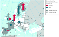
The map shows the temporal trend of bird and butterfly CTI for each country. A temporal increase in CTI directly reflects that the species assemblage of the site is increasingly composed of individuals belonging to species dependent on higher temperature. The height of a given arrow is proportional to the temporal trend and its direction corresponds to the sign of the slope (from south to north for positive slopes). The arrow is opaque if the trend is significant.
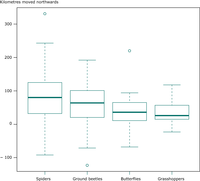
This graph shows the observed latitudinal shifts of the northern range boundaries of species within 4 exemplar taxonomic groups, studied over 25 years in Britain. (A) Spiders (85 species), (B) ground beetles (59 species), (C) butterflies (29 species), and (D) grasshoppers and allies (22 species). Positive latitudinal shifts indicate movement toward the north (pole); negative values indicate shifts toward the south (Equator). Horizontal lines mark the Median, boxes the 25 to 75 % quartile and whisker the range (up to 1.5 times the interquartile distance). Open Circles are outliers.
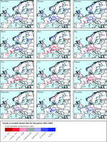
Trend given as standard deviations per year for monthly stream flow.
Red colours mark decreases in stream flow whereas blue colours mark increases in stream flow.
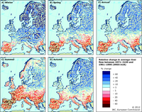
Projected change in mean annual and seasonal river flow between the climate change scenario (SRES A1B, 2071-2100) and the control period (1961-1990). Simulations with LISFLOOD based on an ensemble of 11 RCMs.

The figure shows the expected average percentage of stable area of 856 plant species for two different climate scenarios by 2100. The S550e scenario corresponds to a stabilisation at 550 ppm CO2 equivalent and a global mean temperature increase of 2°C, the baseline scenario corresponds to a global mean temperature increase of more than 3°C.
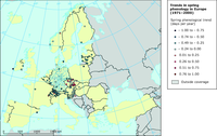
This figure shows the spring trends of phenology 1971-2000 grouped by their mean onset date. Each dot represents a station. Dot size adjusted for clarity. A negative phenological trend corresponds to an earlier onset of spring.
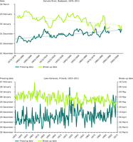
Ice break-up dates and freezing dates of
a) Danube River, at Budapest, 1876–2011 (5-year running average) and
b) Lake Kallavesi, Finland, 1833–2011.

Relative change in minimum river flow for a) 2020s, b) 2050s and c) 2080s compared to 1961-1990 for SRES A1B scenario.
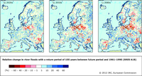
Projected change in the level of a 100-year maximum level of river discharge between the reference period 1961–1990 and the 2020s (left), 2050s (centre) and 2050s (right) based on an ensemble of 12 RCM simulations with LISFLOOD for the SRES A1B scenario.
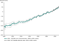
The figure shows the global mean sea level from 1860 to 2009 as estimated from coastal and island sea-level data (1880 – 2009, blue) and from satellite altimeter data (1993 – 2009, grey).
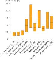
This figure shows the range of high-end global sea-level rise (metre per century) estimates published after the IPCC Fourth Assessment Report (AR4). AR4 results are shown for comparison in the three left-most columns.
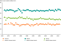
The figure shows the mean autumn (September, October, November), winter (December, January, February) and spring (March, April, May) snow cover extent over the Northern Hemisphere in 1967–2011 with linear trends.

The figure shows the multi-model mean of changes in annual snowfall days from 1971-2000 to 2041-2070 exceeding (left) 1 cm and (right) 10 cm based on six RCM simulations and the emission scenario A1B
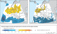
Ensemble mean of changes in extreme wind speed (defined as the 98th percentile of daily maximum wind speed) for A1B (2071–2100) relative to 1961–2000. Left: based on 9 GCMs. Right: based on 11 RCMs. Coloured areas indicate the magnitude of change (unit: m/s), statistical significance above 0.95 is shown by black dots.

Trends in the annual 95th percentile of daily maximum wind speeds in the 20th century reanalysis data set (ensemble mean) during the period 1871–2008.
The trend is given in the units of the interannual standard deviation and plotted only when significant. The coloured circles indicate trends in the number of
'gale days' (an index that represents the number of extremely windy days) over the period at the specific locations.

The figure shows the change in yearly cumulated area of the Greenland ice sheet and it's melt during the period 1979 to 2011 in percentage relative to area in 1979=100. The linear trend 1979–2011 is included.

The figure shows the mass balance of the Greenland ice sheet from mass budget calculations.

-

Concentrations are expressed as a median of annual mean concentrations. Up to three-year gaps of missing values have been interpolated or extrapolated. Only complete series with no missing values after this interpolation/extrapolation are included. The number of time series/river stations is shown in parentheses. The trend for 1992 to 2010 for each of the ecological quality classes has been linearly extended to 2027 — or when the concentration level becomes negative.