next
previous
items

Figure

Observed annual mean temperature change from 1960 to 2019 (left panel) and projected 21st century change under different emissions scenarios (right panels) in Europe

Figure Created 16 Sep 2020 Published 30 Sep 2020 Last modified 12 Jun 2023
1 min read
This is an old version, kept for reference only.

Go to latest version
This page was archived on 12 Jun 2023 with reason: Other (New version data-and-maps/figures/trends-in-annual-temperature-across-2 was published)
RCP, representative concentration pathway. 
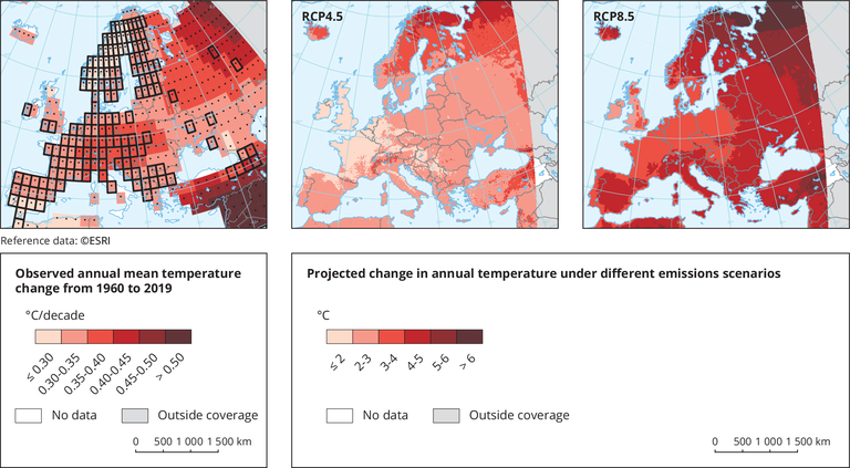
Left panel: boxes outlined in black indicate areas with at least three stations, so are more likely to be representative; areas with significant long-term trends are indicated by black dots. Right panel: projected changes in near-surface air temperature by the period 2071-2100, compared with 1971-2000 for RCP4.5 and 8.5 emissions scenarios; simulations are based on the multi-model ensemble average of simulations of the EURO-CORDEX initiative.

Metadata

Additional information

Boxes outlined in solid black contain at least three stations and so are likely to be more representative of the grid. A significant (at the 5 % level) long-term trend is shown by a black dot. Stations available in the European Climate Assessment and Datasets (ECA&D) (with different lengths of records) for daily maximum and minimum temperature.

Permalinks

Geographic coverage

Temporal coverage

Topics

Document Actions