Urban Waste Water Treatment Directive concerns the collection, treatment and discharge of urban waste water and the treatment and discharge of waste water from certain industrial sectors. The objective of the Directive is to protect the environment from the adverse effects of the above mentioned waste water discharges. The published output contains data reported in 2022. Current output is provisional, as it is subject to the Commission's compliance check, following which some records may be amended and further information will be added.

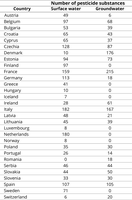
For each European country, which reported pesticide data under WISE 6 in time period 2013 to 2020, information on numbers of reported pesticides for both surface waters and groundwater is listed.

This is the result of the 2016 questionnaire commissioned by the Eionet Thematic Group Soil, EEA and the European Commission Joint Research Centre, for the revision of the Indicator "Progress in the management of contaminated site in Europe". The 2016 results have been quality-controlled and corrected in 2022, serving as the basis for this indicator update. The Eionet Thematic Group Soil (formerly National Reference Centres Soil) consists of experts from EU Member States as well as EFTA countries, and EU candidate and potential candidate countries (EEA-38).

The present map provides the spatial extent of MSFD regions and subregions, as agreed by the MSFD Committee in November 2016.
In the Marine Strategy Framework Directive - MSFD (Directive 2008/56/EC of the European Parliament and of the Council of 17 June 2008 establishing a framework for community action in the field of marine environmental policy), four marine regions are listed (Article 4): Baltic Sea, North-east Atlantic Ocean, Mediterranean Sea and the Black Sea

Natura 2000 is the key instrument to protect biodiversity in the European Union. It is an ecological network of protected areas, set up to ensure the survival of Europe's most valuable species and habitats. Natura 2000 is based on the 1979 Birds Directive and the 1992 Habitats Directive. This version covers the reporting in 2021, revision 1. Two member states, Germany and Ireland, were rolled back to their previous submissions in the European dataset.

The map shows the number of premature deaths (PDs) attributed to PM2.5 in 2020 at NUTS3 level for European countries. The PDs, which in absolute terms are higher for those NUTS3 level regions with the highest populations, have been normalised by 100,000 inhabitants, to make the numbers comparable among regions. For countries where NUTS3 regions are not available, the national value is shown.

The dataset “Extended wetland ecosystem” is a derived product of the Corine Land Cover (CLS) layer for the year 2018 which has then been reclassified into 20 wetland classes on the basis of ancillary spatial layers (“Water and Wetness 2018” and “Riparian Zone Layer” Copernicus products, the “Ecosystem types of Europe” v3.1 and “The Global Spatial Water Explorer” datasets).
Besides the traditional types of inland and coastal wetlands (i.e. marshes, rivers, lakes, lagoons, estuaries), the layer also covers the forest, grassland and agricultural ecosystems which are seasonally or permanently flooded (i.e. riparian forests, wet grasslands, rice fields) and are therefore considered as wetlands according to the Ramsar Convention definition and typology. This wetland reclassification and mapping considers their hydro-ecological characteristics and provides information about the real spatial extent and distribution of varied wetland habitats.

The EEA marine assessment vector areas are harmonised units used for statistics. The assessment areas allow the consistent calculation of status and trends in the EU waters, e.g. for marine protected areas coverage.

Wheat yield losses at country level, expressed in % of yield loss, aggregated from the regional NUTS2 level losses