-
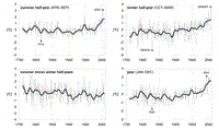
Single years (thin lines) and 20-year smoothed means (bold lines). All values relative to 1851–2000 averages, summer and
winter half-years (first row), annual means and annual range (second row).

Difference on the percentage of people exposed to more than 55dB Lden and more than 50 dB Lnight inside and outside mountain areas in Austria. The calculations were done excluding the number of people exposed inside Viena and considering two different noise sources: noise from major roads (with more than 6 mio vehicles/year) and noise from major railways (with more than 60.000 train passages/year).
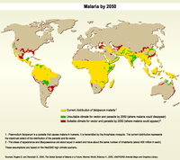
The map shows the current distribution of falciparum malaria (in yellow), areas where it is projected to appear (in red) and disappear (in green) by 2050.
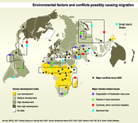
Colors show Human development Index ranking. Symbols locate possible causes of displacements: environmental upheavals related to climate change and major conflicts since 2000.
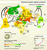
The map shows 'moving to work and escape poverty': Migration between and inside world regions from 1995 to 2004. Colors show regional migratory balance (surplus or deficit), arrows show major movements between and inside regions.
The graph shows 'travelling for leisure': trends in number of tourists since 1950 and projections to 2020.

Car ownership trends and projections (2000-2050). Although car ownership is projected to grow at much higher rates in China and India than in the rest of the world, the number of cars per person in 2050 will still stay below that of more advanced economies.
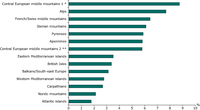
The graph describes the percentage of each massifs affected by infrastructure network (Roads, railways and inland waterways of versions 1996, 2001 and 2003).
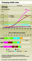
Trends and projections (2000- 2050) of middle-class consumption, showing the growing importance of middle-class consumers in China and India.
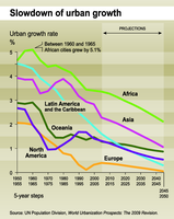
Historical trends and projections by world regions (1950- 2050) of urban growth rate showing a clear slowdown for all regions

Historical urban population trends and projections by world regions (1950- 2050), showing the share of cities with less than 750 000 inhabitants
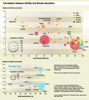
The graph shows the correlation between adult female literacy (X-axis) rates and fertility rates (Y-axis) by country. Circles are proportional to national country population.
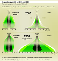
Comparison between the year 2000 and projected 2050 population by age, sex and educational attainment for Africa and the European Union

Median age is the age that divides a population into two numerically equal
groups: half the people are younger and half are older. The graphics compares population ageing between world regions and between selected countries since 1950 and up to projected median age in 2050.

Historical population trends and projections by world region
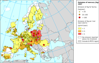
The map shows the emissions of mercury to water based on E-PRTR reporting of 2007 data
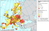
The map shows the emissions of cadmium to water based on E-PRTR reporting of 2007 data
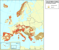
The map rapresents the infrastructure network (Roads, railways and inland waterways of versions 1996, 2001 and 2003) that pass through the massifs
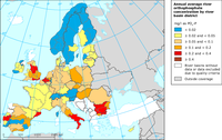
The map shows the annual average river orthophosphate concentration by river basin district (mg/l as PO4-P) in 2008
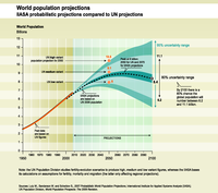
This graph compares population projections to 2100 resulting from 2 organisations: the UN Population Division studies fertility-evolution scenarios for produce high, medium and low variant figures, whereas the IIASA bases its calculations on assumptions for fertility, mortality and migration.