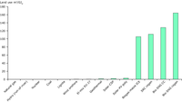
The graph illustrates that energy systems differ in the extent and complexity of their impacts by presenting the projected life cycle land use of fossil, nuclear and renewable electricity systems in 2030. To understand the implications of increased bioenergy production, it is important to recognise that the land used for energy cropping is a natural resource, comprising soil, minerals, water and biota. Where bioenergy involves energy cropping it often necessitates changes to land use, with significant implications for related systems as well Other renewable technologies do also use some land and so do fossil and nuclear systems but the area is comparatively small. Nevetheless these technologies have other limitations.

The potential estimates refer to the EU’s agricultural bioenergy potential in 2020 for 3 storylines. These storylines explore plausible bioenergy development paths from a resource efficiency perspective under three specific sets of economic and political assumptions.
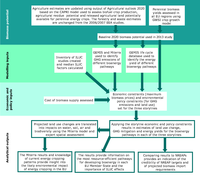
The schema shows the analytical chain employed in assessing the EU bioenergy potential.

The graph gives an overview of the absolute contribution of perennials per type to the bioenergy potential of a country in the Climate focus storyline.

The schema shows carbon restocking curves over time.

The schema shows a simplified chain of effects that use of land for bioenergy production can bring about.
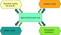
The schema illustrates the interactions between land use and important environmental cycles.

The graph gives an overview of the absolute contribution of perennials per type to the bioenergy potential of a country in the market first storyline.
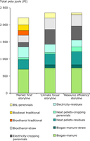
The 2012 study potential estimates refer to the EU’s agricultural bioenergy potential in 2020 for 3 storylines. These storylines explore plausible bioenergy development paths from a resource efficiency perspective under three specific sets of economic and political assumptions.

The 2012 potential estimates refer to the EU’s agricultural bioenergy potential in 2020 for 3 storylines. These storylines explore plausible bioenergy development paths from a resource efficiency perspective under three specific sets of economic and political assumptions.
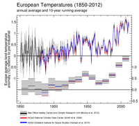
The sources of the original data: 1) Black line - HadCRUT4 from the UK Met Office Hadley Centre and University of East Anglia Climate Research Unit, baseline period 1850-1899 (Morice et al. 2012) with the grey area representing the 95% confidence range, 2) Red line – MLOST from the US National Oceanic and Atmospheric Administration (NOAA) National Climatic Data Centre, baseline period 1880-1899 (Smith et al., 2008), and 3) Blue line - GISSTemp from the National Aeronautics and Space Administration (NASA) Goddard Institute for Space Studies, baseline period 1880-1899 (Hansen et al., 2010). Upper graph shows anomalies and lower graph shows decadal average anomalies for the same datasets.
Europe is defined as the area between 35° to 70° North and -25° to 30° East, plus Turkey (35° to 40° North and 30° to 45° East).
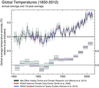
Global average air temperature anomalies (1850 to 2012) in degrees Celsius (°C) relative to a pre-industrial baseline period for 3 analyses of observations: 1) Black line - HadCRUT4 from the UK Met Office Hadley Centre and University of East Anglia Climate Research Unit, baseline period 1850-1899 (Morice et al. 2012) with the grey area representing the 95% confidence range, 2) Red line – MLOST from the US National Oceanic and Atmospheric Administration (NOAA) National Climatic Data Centre, baseline period 1880-1899 (Smith et al., 2008), and 3) Blue line - GISSTemp from the National Aeronautics and Space Administration (NASA) Goddard Institute for Space Studies, baseline period 1880-1899 (Hansen et al., 2010). Upper graph shows annual anomalies and lower graph shows decadal average anomalies for the same datasets.
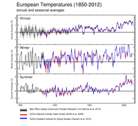
European average air temperature anomalies (1850 to 2012) in °C over land areas only, for annual (upper), winter (middle) and summer (lower) periods relative to pre-industrial baseline period. 1) Black line - HadCRUT4 from the UK Met Office Hadley Centre and University of East Anglia Climate Research Unit, baseline period 1850-1899 (Morice et al. 2012) with the grey area representing the 95% confidence range, 2) Red line – MLOST from the US National Oceanic and Atmospheric Administration (NOAA) National Climatic Data Centre, baseline period 1880-1899 (Smith et al., 2008), and 3) Blue line - GISSTemp from the National Aeronautics and Space Administration (NASA) Goddard Institute for Space Studies, baseline period 1880-1899 (Hansen et al., 2010).

Rates of change of global average temperature (1850 to 2012) in ºC per decade, based on 10-year running average of the 3 datasets: 1) Black line - HadCRUT4 from the UK Met Office Hadley Centre and University of East Anglia Climate Research Unit, baseline period 1850-1899 (Morice et al. 2012), 2) Red line – MLOST from the US National Oceanic and Atmospheric Administration (NOAA) National Climatic Data Centre, baseline period 1880-1899 (Smith et al., 2008), and 3) Blue line - GISSTemp from the National Aeronautics and Space Administration (NASA) Goddard Institute for Space Studies, baseline period 1880-1899 (Hansen et al., 2010).
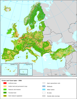
Analysis the Corine Land Cover changes from 2000 to 2006 based on validated Corine Land Cover data.

The figure shows the development of MSW landfilled in EU-27 in relation to 2020 objective
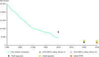
The figure shows the trends for air pollution - sulphur oxides (SOX)

The figure shows the trends for air pollution - particulate matter (PM2.5)
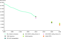
The figure shows the trends for air pollution - Nox
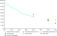
The figure shows the trends for air pollution - NMVOCs
Document Actions
Share with others