h2, h3, h4
-
Boxes
Just like pullquote styles, box components can be used to add emphasis to a section
of content wrapping the selected content with a given box background color.
Note
Note style is used for info message mimicking those found within charts.
Due to compatibility reasons
the font size for this style is fixed to 12px.
Lorem ipsum dolor sit amet, consectetur adipisicing elit.
Aliquid eaque inventore ipsum, iure quidem quisquam.
A autem deserunt dicta ducimus eos expedita facilis hic
illo perferendis possimus quo voluptate, voluptatum?
KeyFacts box
-
Lorem ipsum dolor sit amet, consectetur adipisicing elit.
-
Architecto cumque dignissimos dolor exercitationem fugiat,
harum laborum, officiis optio reiciendis sed similique totam vero.
-
Esse eum laborum qui quibusdam sint tempore.
Fullwidth box
Mattis pellentesque id nibh tortor id aliquet. Amet nisl purus in
mollis nunc. Quisque non tellus orci ac auctor augue mauris.
Faucibus vitae aliquet nec ullamcorper sit amet risus nullam eget.
A diam sollicitudin tempor id. Sed viverra tellus in hac habitasse
platea dictumst vestibulum rhoncus.
Left box
Mattis pellentesque id nibh tortor id aliquet. Amet nisl purus in
mollis nunc. Quisque non tellus orci ac auctor augue mauris.
Faucibus vitae aliquet nec ullamcorper sit amet risus nullam eget.
A diam sollicitudin tempor id. Sed viverra tellus in hac habitasse
platea dictumst vestibulum rhoncus.
Quisque non tellus orci ac auctor augue mauris. Faucibus vitae
aliquet nec ullamcorper sit amet risus nullam eget. A diam sollicitudin
tempor id. Sed viverra tellus in hac habitasse platea dictumst
vestibulum rhoncus. Amet consectetur adipiscing elit pellentesque
habitant. Fermentum odio eu feugiat pretium nibh ipsum consequat
nisl vel. Viverra mauris in aliquam sem. Turpis massa sed elementum
tempus egestas sed sed risus pretium. Fermentum iaculis eu non diam
phasellus. Consequat id porta nibh venenatis.
Right box
Mattis pellentesque id nibh tortor id aliquet. Amet nisl purus in
mollis nunc. Quisque non tellus orci ac auctor augue mauris.
Faucibus vitae aliquet nec ullamcorper sit amet risus nullam eget.
A diam sollicitudin tempor id. Sed viverra tellus in hac habitasse
platea dictumst vestibulum rhoncus.
Quisque non tellus orci ac auctor augue mauris. Faucibus vitae
aliquet nec ullamcorper sit amet risus nullam eget. A diam sollicitudin
tempor id. Sed viverra tellus in hac habitasse platea dictumst
vestibulum rhoncus. Amet consectetur adipiscing elit pellentesque
habitant. Fermentum odio eu feugiat pretium nibh ipsum consequat
nisl vel. Viverra mauris in aliquam sem. Turpis massa sed elementum
tempus egestas sed sed risus pretium. Fermentum iaculis eu non diam
phasellus. Consequat id porta nibh venenatis.
Boxes options
Each box has the following options:
- Color options:
- box-primary
- box-secondary
- box-tertiary
- Size options:
- box--full
- box--left
- box--right
All of these box variants are
selectable from the editor style dropdown.
Examples of box-full:
Are you a journalist?
Contact our press team
- EEA Press officer
- EEA Press officer
Notice that this is demo text at full size
Thank you for your contact
| Even table header |
Odd table header |
| Even table item |
Odd table item |
| Odd table item |
Even table item |
Are you a journalist?
Contact our press team
- EEA Press officer
- EEA Press officer
Notice that this is demo text at full size
Thank you for your contact
| Even table header |
Odd table header |
| Even table item |
Odd table item |
| Odd table item |
Even table item |
Are you a journalist?
Contact our press team
- EEA Press officer
- EEA Press officer
Notice that this is demo text at full size
Thank you for your contact
| Even table header |
Odd table header |
| Even table item |
Odd table item |
| Odd table item |
Even table item |
Examples of box--left:
Example is wrapped in clearfix div since box left is
floated left.
Are you a journalist?
Contact our press team
- EEA Press officer
- EEA Press officer
Notice that this is demo text at full size
Thank you for your contact
Are you a journalist?
Contact our press team
- EEA Press officer
- EEA Press officer
Notice that this is demo text at full size
Thank you for your contact
Are you a journalist?
Contact our press team
- EEA Press officer
- EEA Press officer
Notice that this is demo text at full size
Thank you for your contact
Examples of box--right:
Example is wrapped in clearfix div since box right is
floated right.
Are you a journalist?
Contact our press team
- EEA Press officer
- EEA Press officer
Notice that this is demo text at full size
Thank you for your contact
Are you a journalist?
Contact our press team
- EEA Press officer
- EEA Press officer
Notice that this is demo text at full size
Thank you for your contact
Are you a journalist?
Contact our press team
- EEA Press officer
- EEA Press officer
Notice that this is demo text at full size
Thank you for your contact
Cards
Used on themecentre pages,
these cards are used to promote featured content for the themecentre section.
Simple card
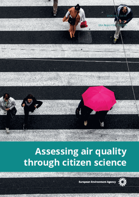
Air pollution is the biggest environmental health threat in Europe and more and more people are taking action to claim their right to clean air. A new European Environment Agency (EEA) report provides an overview of low-cost devices that citizens and NGOs can use to measure local air quality.
Double card
Used on themecentre pages sections,
these cards are used to promote two featured content side by side.
Published: 30 Jun 2020
This briefing presents progress made by the EU and its Member States1 towards meeting the 2010 emission ceilings that were applicable until the end of 2019 under Directive 2016/2284/EU — the National Emission reduction Commitments (NEC) Directive — on the reduction of national emissions of certain atmospheric pollutants. In addition, it assesses the emission reduction effort — compared with 2018 emissions levels — required by each country to comply with the 2020 and 2030 reduction commitments set out in the Directive.
Fullwidth card
Used on themecentre pages sections,
these cards are used to promote one featured content predominantly.

Given their proximity to citizens and knowledge of local concerns, local authorities are best placed to ensure we make an effective transition to more liveable and breathable cities.
Many city-specific measures have proved to be efficient but there is still much to do to empower citizens further and deliver coordinated actions across all governance levels.
Card options (variables)
The following modifier classes can be added to the eea-card component:
| Name |
Description |
| eea-card--double |
Add whenever you want to use two cards on the same row |
| eea-card--fullwidth |
Add whenever you want card to span full width of parent |
| eea-card--bg-light |
Add whenever you want background color of body description to be white |
| eea-card--landscape |
Add whenever you want to use a landscape image |
| eea-card--portrait |
Add whenever you want to use a portrait image |
Fancybox is a popup component where content is visible in a box upon
clicking on a link.
You can have arbitrary HTML in the pop-ups:
Image gallery
This component takes a bunch of images and displays them in a carousel
image gallery.
You need to enter an image scale after the image src otherwise the gallery
will load the full-resolution images which could drastically slow the
page.
-
Overlay text goes here
-

You can now use more than one galleryView on the page if needed by using
the
gallery class.
Also you can disable the filmstrip by assigning the
js-noFilmstrip class to the gallery
as you can see in the example below.
Make sure that this gallery also has an id thou as the gallery makes use
of it.
Also if you add a width and height as an inline style the gallery will
match these sizes instead
of growing to the size of it's parent as it does by default.
-
Overlay text goes here
-
Used on our site usually when we want to group similar content which
can be hidden by default unless clicked upon, accordions can also be used
as replacement for tabs when there are many headers or on mobile resolutions
where there isn't enough space to list all of the tab lists on one line.
jQuerytools accordion (standard)
First panel title
Lorem ipsum dolor sit amet...
Second panel title
Claritas est etiam processus dynamicus...
Third panel title
Suspendisse tristique sapien non ipsum...
First panel title
Lorem ipsum dolor sit amet...
Second panel title
Claritas est etiam processus dynamicus...
Third panel title
Suspendisse tristique sapien non ipsum...
First panel title
Lorem ipsum dolor sit amet...
Second panel title
Claritas est etiam processus dynamicus...
Third panel title
Suspendisse tristique sapien non ipsum...
First panel title
Lorem ipsum dolor sit amet...
Second panel title
Claritas est etiam processus dynamicus...
Third panel
title
Suspendisse tristique sapien non ipsum...
After Briefing content type redesign some new classes were created
in order to simplify the design of the accordions.
By applying the eea-accordion-panels-plain class to
the accordion construct we change the design of the headers and panels
to a more discreet look and feel.
Besides the lack of background
color of the accordion panels these headers also use
eea-icon-left-container class in order to move the
accordion arrow to the left of the title instead of the right found in
the classic accordion design.
First panel title
Lorem ipsum dolor sit amet...
Second panel title
Claritas est etiam processus dynamicus...
Third panel
title
Suspendisse tristique sapien non ipsum...
With the plain design we also have a border modifier which if applied
adds a larger top border to the start of the accordion panels.
We can either choose to use
eea-accordion-panels-bordered-primary
which is used now on our website for the metadata info below the related
content area,
First panel title
Lorem ipsum dolor sit amet...
Second panel title
Claritas est etiam processus dynamicus...
or eea-accordion-panels-bordered-secondary meant to be
added manually to the Briefing Identifiers, References and footnotes
section.
First panel title
Lorem ipsum dolor sit amet...
Second panel title
Claritas est etiam processus dynamicus...
Photo Album cards
Album views photo album cards
Used on atct_album_view template as well as other listings where we need to layout
objects as part of an photo gallery album listing.
Other components that make use of this component are:
- Tab panels
- Accordion panels
Styled for the latest Briefing redesign the photoAlbum component has the
following look when it's part of the relatedItems section.
Styled for the latest Briefing redesign the photoAlbum component has the
following look when it's part of the relatedItems section.
Styled for the latest Briefing redesign the photoAlbum component has the
following look when it's part of the relatedItems section.
Tabs
Daviz tabs
Used by
Daviz content types
this tab resembles the jquerytools tab variant that also uses icons in the tabs.
It assumes the following structure:
Chart content panel, pay attention to classname of tab link for proper
tab image
Table content panel, pay attention to classname of tab link for proper
tab image
Used by
Indicator Assessment
figure tabs, these elements make use of default Plone 4 form_tabbing.js logic to
create tabs out of dl, dt and dd html tags.
It assumes the following structure:
- Tab title
-
Tab content is here
- Tab title 2
-
Tab 2 content is here
Server side tabs
Clicking on the tab which will take you to the page that the links points
to.
As template logic you have to supply the current class on the tab that
should be activated given the page visited.
These tabs are the most common type of tabs that we have on the site,
used on several sections such as:
- Frontpage what's new gallery area
- Data and maps page
- Related contents area of each content type
- First tab
- Second tab
- Third tab
Lorem ipsum dolor sit amet, consectetuer adipiscing elit, sed diam nonummy nibh euismod tincidunt ut laoreet dolore magna aliquam erat volutpat. Ut wisi enim ad minim veniam, quis nostrud exerci tation ullamcorper suscipit lobortis nisl ut aliquip ex ea commodo consequat.
Claritas est etiam processus dynamicus, qui sequitur mutationem consuetudium lectorum. Mirum est notare quam littera gothica, quam nunc putamus parum claram, anteposuerit litterarum formas humanitatis per seacula quarta decima et quinta decima. Eodem modo typi, qui nunc nobis videntur parum clari, fiant sollemnes in futurum.
Suspendisse tristique sapien non ipsum rutrum quis blandit nulla laoreet. Aliquam erat volutpat. Proin elementum pretium diam varius consequat. Pellentesque habitant morbi tristique senectus et netus et malesuada fames ac turpis egestas.
Previously we had an extra modifier class to eea-tabs named
two-rows which added a max width to the tabs breaking
some extra long titles into two rows in order to fit extra titles on one row.
Now with the current behavior eea-tabs transform into an
accordion
when any of the tab lists span over more than one line by checking the size
of every element on window resize.
Upon another resize event, as soon as there is enough space to show
every tab title on one line the accordion will transform back into a tab.
You can check this behavior by resizing the browser window and checking
the example below as it transforms from a tab into an accordion and back.
- First tab
- Tab that will trigger accordion transformation on browser resize
- Third tab
Lorem ipsum dolor sit amet, consectetuer adipiscing elit, sed diam nonummy nibh euismod tincidunt ut laoreet dolore magna aliquam erat volutpat. Ut wisi enim ad minim veniam, quis nostrud exerci tation ullamcorper suscipit lobortis nisl ut aliquip ex ea commodo consequat.
Claritas est etiam processus dynamicus, qui sequitur mutationem consuetudium lectorum. Mirum est notare quam littera gothica, quam nunc putamus parum claram, anteposuerit litterarum formas humanitatis per seacula quarta decima et quinta decima. Eodem modo typi, qui nunc nobis videntur parum clari, fiant sollemnes in futurum.
Suspendisse tristique sapien non ipsum rutrum quis blandit nulla laoreet. Aliquam erat volutpat. Proin elementum pretium diam varius consequat. Pellentesque habitant morbi tristique senectus et netus et malesuada fames ac turpis egestas. Integer eget tincidunt mauris.
The synthesis report informs future European environmental policy
in general and its implementation between 2015 and 2020 in
particular. It includes a reflection on the European environment in
a global context, as well as chapters summarising the state of,
trends in, and prospects for the environment in Europe.
Lorem ipsum dolor sit amet, consectetuer adipiscing elit, sed diam nonummy nibh euismod tincidunt ut laoreet dolore magna aliquam erat volutpat. Ut wisi enim ad minim veniam, quis nostrud exerci tation ullamcorper suscipit lobortis nisl ut aliquip ex ea commodo consequat.
Duis autem vel eum iriure dolor in hendrerit in vulputate velit esse molestie consequat, vel illum dolore eu feugiat nulla facilisis at vero eros et accumsan et iusto odio dignissim qui blandit praesent luptatum zzril delenit augue duis dolore te feugait nulla facilisi.
Vel eum iriure dolor in hendrerit in vulputate velit esse molestie consequat, vel illum dolore eu feugiat nulla facilisis at vero eros et accumsan et iusto odio dignissim qui blandit praesent luptatum zzril delenit augue duis dolore te feugait nulla facilisi. Nam liber tempor cum soluta nobis eleifend option congue nihil imperdiet doming id quod mazim placerat facer possim assum.
Tiles
Plone tiles
Used by the folder_summary_view
template and in listings such as the what's new tab section on EEA frontpage,
this tile's design and markup resembles Bootstrap's media object component.
Search app is also using this component as
part of the list layout.

Site typography, including global settings, headings, body text, lists.
Themes tile card
Originally created for the elastic search apps, eea-tile components resemble
the Bootstrap card component
and they are used in places where there is a need to feature certain titles by using a traditional card component design.
Used on the themes page
these tiles are used to promote featured content for the themes listing section.
Search app tiles
Colored tiles
Used on the search app frontpage
these tiles are used to promote the ranges of values found for the right side facets.
These tiles components resemble
Bulma's tile layout component.
Card tiles
Used on the card layout of the search app,
these tiles are used to list result objects arranged as cards.
The search app card tile design is added to the EEA website and
they are documented in this page as well, however
there are the following styles and behavior differences between these two:
- There are extra styles for object type, type thumbnail, tags and url
- On hover there is an animation effect and description slide in view action
Because of the missing styles currently the tile will look worse than it
does on the search app as such we also show 2 screenshots of how a tile looks
normally and when hovered.
TinyMCE templates
Besides the styles that you can select from the style dropdown we also
have several templates that wrap several html tags in order to have more
complex styles.
Here we list the following templates:
Tiles
Tiles are templates used to write a large impact text
or a title followed by a video.
Within tiles we have the following variations:
One tile
of tracking industrial emissions
Two tiles with video content
Three tiles
of tracking industrial emissions
of tracking industrial emissions
of tracking industrial emissions
Four tiles
of tracking industrial emissions
of tracking industrial emissions
of tracking industrial emissions
of tracking industrial emissions
Tiles options
Tiles have a tile--bordered modifier which if applied
adds a top and bottom grey border to the tile section.
They can also be wrapped with fullwidth background sections
in case we need to provide such a focus area for the tiles.

Document Actions
Share with others