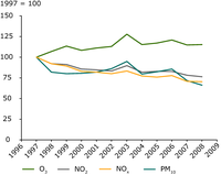
"Annual mean concentrations of air pollutants in urban areas"
Indexed trend in annual mean urban air quality over the period 1997-2008 (reference year 1997). All urban and suburban background stations operational (that is at least reporting over 9 years with a yearly coverage of at least 274 days) during the period 1997-2008 are included. A general, Europe-wide averaged picture is shown, with a bias towards regions with high station density.
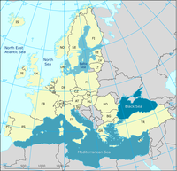
-
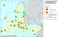
The map shows the annual average groundwater nitrate concentrations in different European countries.
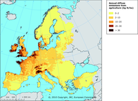
The map shows the annual diffuse agricultural emissions of nitrogen to freshwater
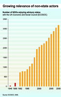
This bar graphic shows the number of NGOs enjoying advisory status with the UN Economic and Social Council (ECOSOC) from 40 countries in 1948 to 3187 countries in 2008.
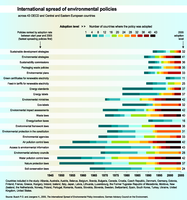
The figure compares the proliferation of twenty-three environmental policy innovations between 1945 and 2005 across 43 OECD and Central Eastern European Countries. The colours represent adoption levels from dark blue (less than 4 countries adopting the policy) to brown (more than 40 countries adopting it). The policies are ranked by adoption rate between start year and 2005 (fastest spreading policies first).
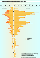
This horizontal bar graphic shows the numbers of bilateral (left-hand axis) and multilateral (right-hand axis) environmental agreements started each year since 1900. It distinguishes original agreements and protocols (darker orange).
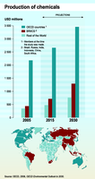
The bar graphic compares current (2005) and projected (2015 and 2030) chemicals production for 3 world regions in USD. The map precise the regions considered: OECD countries (darker blue), BRIICS countries (red), and rest of the world (pale blue).
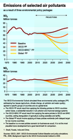
The 2 line graphics show SO2 and NOx emission trends from 1970 to 2050 according to 4 scenarios: the baseline, Global PP, OECD+BRIC PP, Global PP
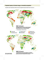
The maps show projected impacts of climate change on terrestrial ecosystems: forest cover gain, shrub/woodland cover gain, herbaceous cover gain, desert amelioration, grass/tree cover loss, forest/woodland decline, forest type change, according to 2 climate scenarios (SRES B1 and SRES A2).
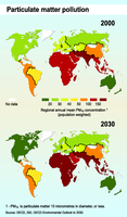
2 comparable maps showing current (2000) and projected (2030) PM10 regional concentrations (population weighted).
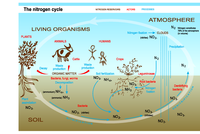
Global scheme of nitrogen cycle, showing major nitrogen reservoirs (atmosphere, soil and living organisms), major processes (nitrification, denitrification, nitrogen fixation, assimilation etc.) and actors (plants, animals, bacteria, human beings).
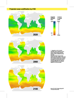
The maps show projected ocean acidification and related impacts on corals by 2020, 2060 and 2100: from better (blue) to worse (orange) conditions for coral skeletal growth.

For the graph: 2006 and projected 2030 world use of neodymium, germanium and tantalum. The technologies responsible for the growth in use of these materials by 2030 are indicated in red. For the map: The bars show estimated reserves of rare earth elements, germanium and tantalum.
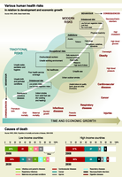
Top graph: From traditional to modern health risks, this “health transition” scheme describes the relation between development and health, distinguishing behavioural risks and the correlated diseases and death causes. Some risks are specifically related to developing countries (blue part of the scheme), others are typically worrying in developed countries (brown part) and some occur everywhere (blue and brown intersection).
Bottom graph: Comparison between 2008 and 2030 projected causes of death for 2 income groups.showing the growing projected imoortance of cardiovascular diseases and cancers.
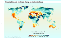
The map shows mean variation in annual run-off in 1981-2000 and 2081-2100
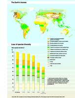
The map: Locating biomes (or regional ecosystems) throughout the world.
The graph: The bars compare the impacted states of selected biomes (or regional ecosystems) at various historical dates and projected 2050. These impacts are expressed using the Mean species abundance (MSA) indicator.
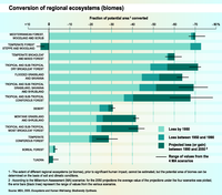
The bars show, for each biome, the fraction of potential area lost by 1950 (pale blue), lost between 1950 and 1990 (blue) and the projected loss by 2050 (dark blue).
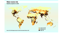
Location of areas of high risk(red), moderate risk (orange) and low risk (white)of water erosion.
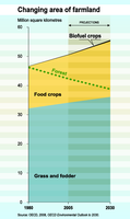
Areas of grass and fodder, food crops and biofuel crops trends for 1980, 2005 and 2030. Forested areas are also added as a comparison.