All official European Union website addresses are in the europa.eu domain.
See all EU institutions and bodies
An official website of the European Union | How do you know?
Environmental information systems
EN

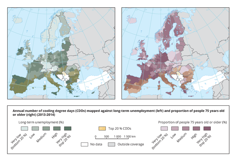
The left map uses a colour gradient to show the long-term unemployment rate per NUTS2 region, classified in quantiles, against the highest number of cooling degree days as hatched areas (only the top 20 % of regions with the highest number of CDDS are shown). The right map uses a colour gradient to show the percentage of the elderly per NUTS2 region, classified in quantiles, against the highest number of cooling degree days represented as hatched areas (only the top 20 % of CDDs are shown).
Loading