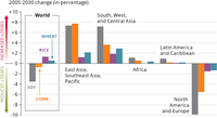
The figure showns projected yield losses due to elevated ozone concentrations. The 2030 scenario assumes the implementation of current legislation for the major world regions. Positive RYL values indicate an increase in crop yield loss in 2030 compared with 2005.

The figure shows changes of urban vs. rural population shares, as observed from 1950 to 2010, and projected until 2050
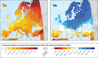
Projected changes are for 2071-2100, compared to 1971-2000, based on the average of a multi-model ensemble forced with the RCP8.5 high emissions scenario. All changes marked with a colour (i.e. not white) are statistically significant. Individual models from the EURO-CORDEX ensemble or high-resolution models for smaller regions may show different results.
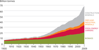
The graph shows the development in global use of construction materials, ores & industrial minerals, fossil energy carriers, and biomass.

The figure shows past (1996 to 2013) and projected (2014 to 2050) economic output (expressed as gross domenstic product, GDP) for selected world economies, given in billion 2005 USD PPP
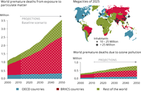
The figure shows the projected premature deaths due to particulate matter and ground-level ozone. The OECD’s forecasts are based on modelling and thus depend on a range of assumptions about current and future air pollution and its interaction with other determinants of health, including the potential gains from air and climate policies. The forecasts consider only urban population and include the projected ageing of populations in the coming decades. BRIICS countries: Brazil, Russia, India, Indonesia, China, South Africa
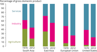
The graphs shows the contribution of service, industry and agriculture to aggregate economic output.
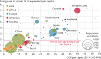
The graph shows per capita energy consumption (kg oil equivalent) vs. per capita GDP, PPP (current international $). The size of the bubbles denotes total poulation per country. All values refer to the year 2011.

The figure shows the 20 raw materials identified by the European Commision as being critical because risks of supply shortage and their impacts on the economy.
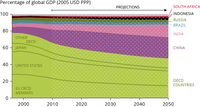
The figure shows the countries and country groups share of global Global Domestic Product, GDP (in percentage)