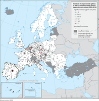
The map shows trend analysis considering the 93.2 percentile of O3 maximum daily 8-hour concentrations at monitoring sites. The coloured squares represent stations with "significant" trends, while the black dots represent stations with “non-significant” trends

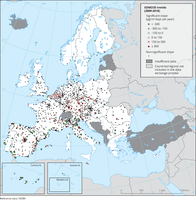
The map shows trend analysis considering the ozone indicator SOMO35 calculated at monitoring sites. The coloured squares represent stations with "significant" trends, while the black dots represent stations with “non-significant” trends.

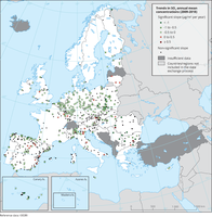
The map shows trend analysis considering SO2 annual mean observations at monitoring sites. The coloured squares represent stations with "significant" trends, while the black dots represent stations with “non-significant” trends.

Observed concentrations of SO2 in 2018. The map shows the SO2 annual mean, which is not related to any legal standard, for comparison purposes. Only stations with more than 75 % of valid data have been included in the map.

Observed concentrations of NO2 in 2019. The data presented were reported as up-to-date (UTD) data and therefore should be considered as not validated. They are used for the purpose of providing a preliminary assessment of the situation in 2019 in relation to the NO2 annual limit value. Triangles in the last two colour categories correspond to values above the EU annual limit value and the identical WHO AQG (40 μg/m3). Only stations with more than 75 % of valid UTD data have been included in the map.
Document Actions
Share with others