next
previous
items

Dos and don’ts of data visualisation — European Environment Agency (eea.europa.eu)

Page Last modified 16 Apr 2021
17 min read
Usability guidelines for improving your visualisations


HIGHLIGHT YOUR MESSAGE

Do tell the ‘why’ and ‘how’: annotations.

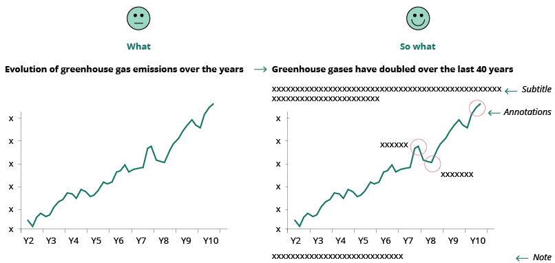
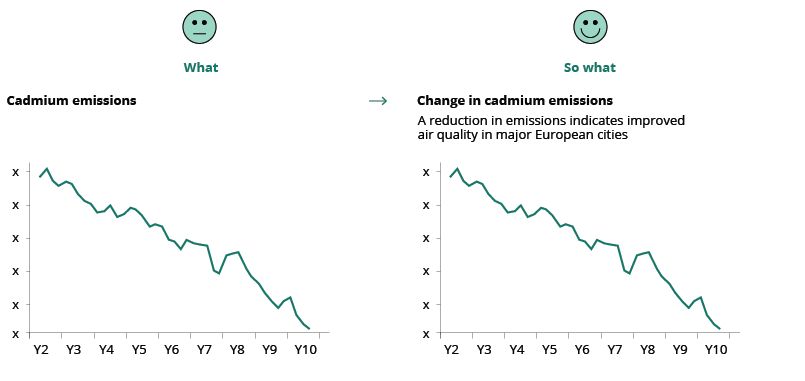
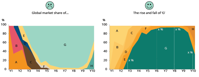
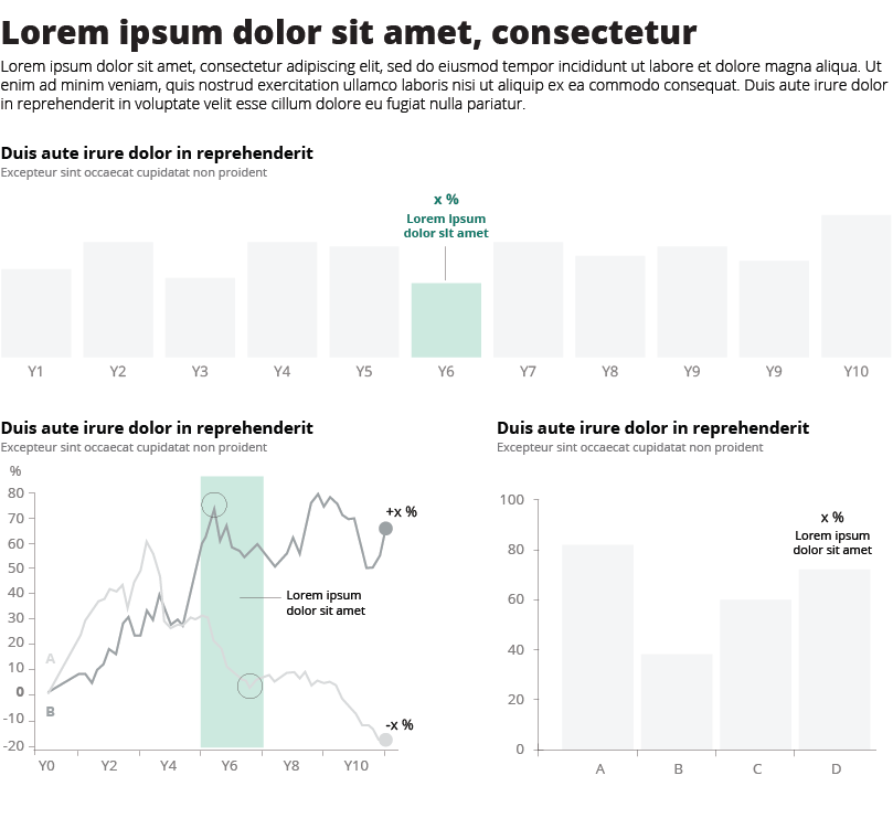
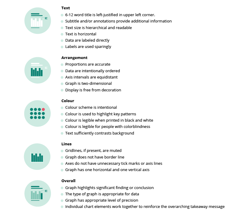
Use a descriptive chart title and other annotations that not only describe what is being measured, but also why the reader should care and how to read the chart. This will avoid misinterpretation and save time for the chart reader.

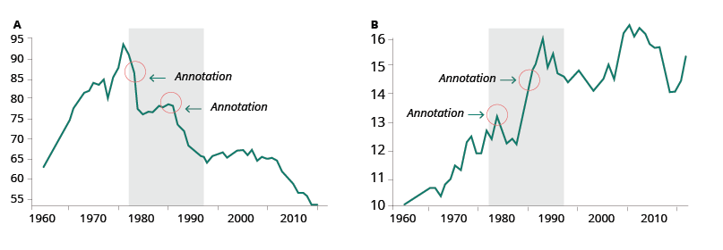
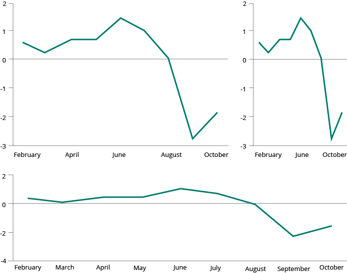
The title of your visualisation is the first thing the reader will see so it needs to clearly state what is being measured. Include information in the title about the insight the reader will gain from the visual. This tells the reader why you are showing it, allowing for a better comprehension of the chart. Sometimes it is helpful to add text that explains how to read the chart, even if it is simple (e.g., Is this trend positive or negative?). Further details may be revealed through other annotations that try to answer to the reader’s curiosity (e.g., Why is there a peak/decline there? What happened at this time that may have triggered this change?). Annotations will give a deeper understanding of the content. (See Improving visualisation readability – annotations).

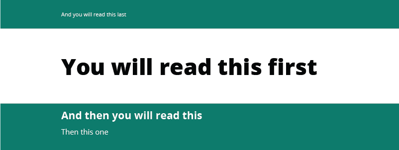
Titles, subtitles, captions, notes and charts work together to convey the chart’s key message and should be written in plain language, so avoid acronyms.

Title

Depending on the data and target audience, the title can adopt different styles:

  • Descriptive title (appropriate for technical audiences): gives a neutral overview of the analysis to come (example).
  • Definitive statement (suitable for general audiences): clearly communicates your message and the insights (example)
  • Question (suitable for non-technical audiences): posing a clear question in your title and providing an answer to it will make data more accessible for your audience (example).

Subtitle

The subtitle can be used to state your key message efficiently, reflecting the insight derived from your analysis.

Annotations

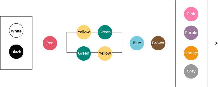
Text may not be the most interesting part of a visualisation but getting it right can significantly improve its readability and provide additional detail and depth. Good annotations make it much easier for those with no prior — or limited — knowledge of the visualised data set. In broad terms, there are two types of annotation: project annotations and chart annotations. See image below:

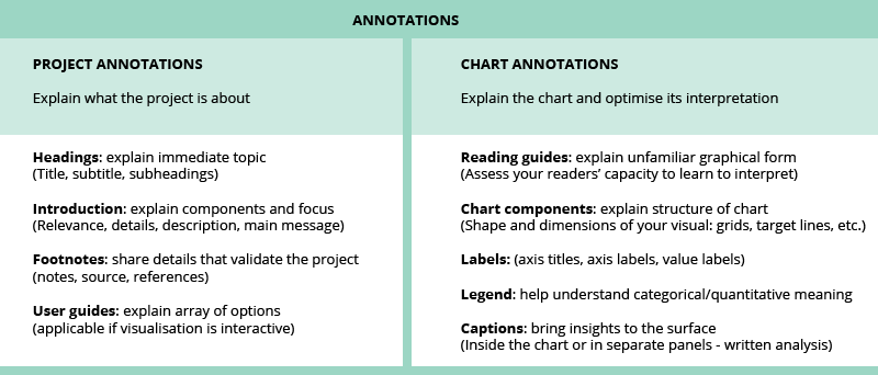
More about annotations

The Atlas of Sustainable Development Goals 2018 makes massive use of descriptive titles and annotations. Here is the presentation of the report to the EU DATAVIZ 2019 audience.

Do highlight what’s important, tell one story


Although it is possible to tell one hundred stories using a single line chart, it makes more sense to focus on just one story.


To better convey a message, you need to guide your audience to the data being analysed. The first step is to have a title that focuses on your insight (See Tell ‘why’ and ‘how’). Then you can graphically highlight your data, keeping other data in the background to give context and allow comparisons.

The same can be done in all sorts of charts.

Sometimes you may need to adjust the chart a bit, to let the story emerge.

At other times, you might need to opt for a different chart type that better enhances the reader‘s focus.

Hierarchy of the information

Consider how your audience will scan and read the visualisation.

If many data are displayed, make wise use of white space to separate and group the information. Use text formatting to give the desired hierarchy to the content and apply colours intentionally to highlight the focus of the data visualisation.


CHOOSE YOUR CHART

Tables are preferable to graphics for many small data sets


Tables are clearly the best way to show the exact numerical values, although the entries can also be arranged in semi-graphical form. Tables are preferable to graphics for many small data sets... Tables also work well when the data presentation requires many localised comparisons... One supertable is far better than a hundred little bar charts.

Edward R. Tufte

‘A chart is worth more than ten thousand words' but, on the other hand, graphical representation is a less rich source of information compared, for instance, to a good old table.

In most cases, a chart and a table are complementary, and both should be used in data representation: figures in the table show the analysis of the phenomena in question, while a graphical representation provides a synthesis, allowing for integral and clear understanding.

Exploratory/explanatory: do choose the right format (flow chart)

Static or interactive?

If you are publishing a visualisation on the website, you may opt for a static or an interactive chart. The first variable that influences the choice is the target audience (see Exploratory/explanatory: choose the right format).

Static charts are often an adequate option because they are easy to access and do not come with the risk of display issues on your browser or other apps.

But sometimes it is strongly recommended to use the interactive version when:

  • there are many categories, and consequently many colours (see Don't use more than (about) six colours) (Example 1);
  • if, due to lack of space, the labels are not visible (Example 2);
  • if the values are so divergent that some of them would not be visible (Example 3);
  • and naturally, if there is a need to sort the values or filter the information.

If the visualisation is for a PDF publication or a PowerPoint slide and you need to produce a static chart, you may consider presenting your data in a different way to avoid the issues mentioned above.

Do choose the chart type wisely

Choose the chart type depending on what you want to show. Get to know the pros and cons of each chart type.

Before you start charting, take a step back and ask yourself what it is you want to show. Choose the right chart type that is best for finding specific patterns and gaining possible new insight in your data.

Online tools
The Data Visualisation Catalogue
Dataviz Project
Decision diagram
One chart at the time (YouTube series of videos)

Bar chart: do use the full axis and avoid distortion

For bar charts, the numerical axis (often the y-axis) must start at zero. 

Use the full axis for bar charts. Our vision is very sensitive to the area of bars and we draw inaccurate conclusions when those bars are truncated.

If you need to show data details that are not visible when using the full axis, then the original chart with full axis can be accompanied with a ’zoomed-in chart‘, a so called ’panel chart' in Excel. See example below:

More reading

http://peltiertech.com/WordPress/broken-y-axis-in-excel-chart/

Making these charts interactive will solve many of the issues stated above. For example, the user would be able to mouse-over a column and get the exact value, filtering out some categories or sorting the columns according to their values for easier comparison.

More about bar charts

Paired bar charts (YouTube video 7:49); Stacked bar charts (YouTube video 3:29); Pyramid chart (YouTube video 8: 13). These videos present the basics, including some interesting reflections on the bar charts.

Pie charts: cons (and pros)

The human brain thinks linearly: we can easily compare lengths/heights of line segments but when it comes to angles and areas most of us can't judge them well. Therefore, try to avoid the use of pie charts when comparing many categories or when categories have similar values.


However, pie charts do work well to display a total and shares thereof, and they are readable if they display only a few categories (maximum 5-6). Other good practices are: to sort the values in a clockwise manner according to your communication aim; to have the labels close to the pie chart (avoid unnecessary effort from the reader); and to use the colours wisely or even use only one colour if the pie chart has labels (to eliminate redundancy). With a specific communication aim, a pie chart with many slices can be used to highlight the biggest or the smallest share.


If you want readers to compare the shares of a total, bar charts and stacked bar charts are better alternatives (See pros and cons of area charts).


More about pie charts

Pie Charts with Robert Kosara: a video (4:58) and his detailed study

What is a pie chart?

What to consider when creating pie charts

5 unusual alternatives to pie charts

Small multiples

Small multiples are an elegant and efficient way to display many data and to avoid cluttering in one single chart. They provide a narrative about the change displayed (if time is represented) and an overview that doesn’t sacrifice the details.

For maps, small multiples may also convey the message much better than an animation, so they are a good alternative to interactive visualisations.

See other examples of when a small multiple chart is the best alternative to a map.

Good practice is to:

  • order the categories intentionally to show trends or ranking;
  • possibly use a common scale;
  • use a simple chart type;
  • use the same colours for all charts.

More about small multiples

Better Know a Visualization: Small Multiples

How to Make Interactive Linked Small Multiples

Stacked charts are difficult for comparing data

Stacked area charts display cumulative trends over time. They are a good choice if showing the total is as important as showing its shares and they work best when there is a large difference between the values.

However, while the contribution to the total of the lowermost attribute is well readable, it is difficult to appreciate other attributes that are far from the reference line. So, it is not the right choice if you want to compare the size of different shares with each other, or if you have many shares.

The choice of chart depends on the focus.

If you want to show the trend of each share, opt for an individual area chart or a line chart.

More about area charts (stacked area and stacked bar charts)

Area graphs (video 8:03)

What to consider when creating area chart

Dual axis charts, pros and cons

There is a debate around dual axis charts. They are mainly used to highlight some relation in the trend of two data sets with different units of measure or to compare two data series with the same measure, but different magnitudes.

The advantage of these charts is that they illustrate a lot of information with limited space. The downside is that they are often not easy to read, and they could even lead to misleading interpretations.

Best practice:

  • To avoid confusion, the data need to be clearly referable to their own axis with the help of colours and text.
  • To avoid misleading interpretation, when using the same unit, the axes should be synchronised.

If you want to keep different scales to see the evolution in detail, you can opt for side-by-side charts and use annotations to highlight possible correlations between the two series.

If you want to keep both data series in one chart, you can create an indexed chart. An indexed chart that does not tell anything about absolute numbers but shows the relative change in data series over time.

Another alternative to the dual axis, is the connected scatterplot.

More about dual axis charts:

Dueling with axis: the problems with dual axis charts
The Do’s and Don’ts of Dual Axis Charts
Why not to use two axes, and what to use instead
Dual axis charts with Nigel Hawtin

MAKE CHARTS EASY TO READ

Do use clear language and avoid acronyms

Try to use clear language in your chart title and descriptions. Avoid acronyms like ‘MS’ and use the extended form ‘Member State’ or even better, simply ‘Country’. It is OK to use well-known abbreviations like EU or GDP, or those your audience understand clearly. 

Do remove any visual clutter (increase data-ink ratio, Tufte’s principle)

Perfection is achieved not when there is nothing more to add, but when there is nothing left to take away.

Antoine de Saint-Exupery

As shown in the example below, it is important to remove any visual clutter to let the content stand out.

  • Remove the background
  • Remove (or lighten) the grid
  • Remove the % on the Y axis, if clarified on top
  • Remove the title of the X axis, if not necessary
  • Remove the legend if the bars can be labelled
  • Remove the colours if not necessary
  • Remove any graphical effect (shadow).

Read more about Data-Ink ratio and Tufte's principles.

Do rotate bar chart when category names are too long

More about horizonal bar charts

My penchant for horizontal bar charts by Cole Nussbaumer

Don’t use a legend when you have only one data category

If there is only one value category plotted in your chart, then there is no need to have a legend. The necessary information can be included in the title instead. Alternatively, you can label the axis directly.

Do use direct labelling wherever possible, avoiding indirect look-up

If possible, label lines individually and avoid legends.

You want to allow instant identification of the lines but looking them up in a legend takes way too much time. Often the legend is below the chart and its elements are in arbitrary order. Instead, place the labels close to the lines.

However, placing a label next to a line could become an issue when multiple lines end at the same point. In that case, place a legend below the chart.

More about line charts

Doing the line charts right, by Gregor Aisch.

Do sort your data for easier comparisons

It is more important to give emphasis to the data itself and sort your chart by data attributes, rather than non-data attributes (e.g., labels like country names).

With the data sorted, a proper comparison across the many bars is easier to do, as is finding a country in the list after a quick scan.

Pie charts work better when presented with sorted data values. Start at 12 o’clock with the largest slice and work clockwise. In this way, it is much easier to understand relations between parts — what is bigger and what is smaller — even when values are not readable, or areas are very similar.

If the chart is interactive, give the user the possibility to change the default sort order and a way to filter out data to compare only a few categories.

Don't use more than (about) six colours

Colour categorisation is not random, and the centres of basic colour terms are very similar in all languages. Using colour categories that are relatively universal makes it easier to see differences between colours. The figure below shows the order of appearance of colour names in languages around the world. The order is fixed, with the exception that sometimes yellow is present before green and sometimes the reverse is the case.
Source: Berlin and Kay (1969)

Use different colours to represent different categories (e.g., private/public, types of pollutant), not different values in a range (e.g., age, temperature). See qualitative colour palette below.

If you want colour to show a numerical value, use a range that goes from light to dark in one of the universal colour categories. See sequential colour palette below.

If you need to represent diverging numeric values (from hot to cold, from good to bad, etc.), use two colours as shown in the diverging colour palette example. 

Do not use rainbows for range values.

More about colour use
Which colour to use in visualisation
When to use qualitative/quantitative colour scales
When to use sequential/diverging colour scales
When to use classed/unclassed colour scales

EEA Corporate colour guidelines

Do be aware of colour blindness (colour vision deficiency)

Colour blindness, also known as colour vision deficiency (CVD) affects approximately 8 % of men and 0.5 % of women in the world. There are an estimated 300 million colour blind people in the world. Below, is an example of how someone with colour blindness would perceive a chart.

Most colour-blind people can detect contrast: using a combination of light and dark colour makes your design more accessible.

Do not rely just on colour to communicate. Different shapes, patterns and textures can help distinguish between different design elements in your visualisation.

One simple way to optimise your design is to avoid using any colour combinations. Use a monochromatic palette in different shades. 

There are easy-to-use colour deficiency simulators online to help you test your visualisation, as well as extensions you can add to your browser:

Coblis — Colour Blindness Simulator

Spectrum - Google Chrome add-on

Colorblinding – Chrome extension


MAKE CHARTS CORRECT

Do use consistent intervals on axis (be transparent on data gaps)

Be clear when some data are missing. Explain the reason why. Use the full axis and do not skip values when you have numerical data.

Do use proper aspect ratio to minimise dramatic slope effects

The slope of a line chart should be close to 45 degrees for better perception.

In the example below, the same data are presented in three ways. The slope reflects the scales used on the two axes:

However, in some cases there can be legitimate reasons for not sticking to banking to 45 degrees. For example, to analyse the data that reveal certain patterns, which otherwise would not be visible in the 45-degree slope. See example below:

More about this topic
https://eagereyes.org/basics/banking-45-degrees

http://vis.berkeley.edu/papers/banking/2006-Banking-InfoVis.pdf

Don't confuse correlation with causation

Quite often superimposing time series of two different measurements will show a strong correlation. It is an easy mistake to confuse correlation with causation. Bias can make us conclude that one thing must cause another if both change in the same way and at the same time.

For example, if you plot two different data series (A and B) on the same chart, you may notice that both follow a similar pattern over time. It is extremely hard, if not impossible, to prove that A caused B or vice versa. There are so many third unplotted factors that may influence both A and B. Only a large profound statistical-based study on all factors can give some indication of causation, if any exists.

More about this topic

https://towardsdatascience.com/correlation-is-not-causation-ae05d03c1f53

Method for identify true correlation by removing the time-series data

https://codingwithmax.com/correlation-vs-causation-examples/

Do adjust for inflation in long-time series


When using economic values in your charts, you must be careful about adjusting the value according to inflation.

Do be careful about how you treat ‘no-data/missing data’ 

Take the following chart as an example of the results of certain observations made on the street. You want to see how many people walking by are wearing glasses (X) or not wearing glasses (Y) in a specific time frame. When you are not able to identify either, you mark it as ‘unknown’. After 1 000 observations you stop collecting data.

The left chart says that 33.5 % wore glasses (X) and 28.6 % did not (Y), while 37.9 % were unknown (the missing data). The issue with the chart above is that the unknown must not be treated as a third category that is different from the other two. The unknown contains both X and Y, most probably with the same distribution. Therefore, the missing data must be removed and only reported separately. This is standard practice in all statistical surveys. On the right, the chart is corrected without the unknown. In this case, an indication of a margin of error would also help.

Don't compare apples with oranges

This rule sounds trivial, but it can be quite difficult to respect when things may appear identical. For example, imagine the following trend analysis of CO2 emissions over time in Europe. From a simplistic point of view, the trend over time for the EU from 1995 to 2014 all looks fine. However, the EU did not consist of the same countries over time and therefore the EU-12 cannot be compared with the EU-25 or the EU-28. The countries that formed the EU-12 are not statistically equal to the countries that were part of the EU-28. This is comparing apples with oranges!

Do show the level of confidence

DASHBOARD

10 best practices for building effective dashboards

  1. Know your audience: modulate the complexity against your audience’s level of expertise.
  2. Consider display size: consider the way your audience is going to consume your data. When designing for mobile, reduce the amount of interactivity. Stack content vertically for phone screens.
  3. Plan for fast load times: for optimisation tips, read here.
  4. Leverage the sweet spot: consider how your audience will ‘read’ your dashboard. Use the design (lines, white space, colours) to create a structure and guide the flow.
  5. Limit the number of views and colours: stick to two or three views in order not to overwhelm the reader. In case you need more, add other dashboards or use a story. Reduce the number of colours and use them intentionally.
  6. Add interactivity to encourage exploration: add filters and a search box, and highlight actions.
  7. Format from largest to smallest: from a formatting perspective, the hierarchy of a dashboard looks like this: 1. Theme; 2. Workbook; 3. Worksheet.
  8. Refining your dashboard: Tooltips are a useful way to reinforce the story. Remember to customise them and format accurately. The Viz in Tooltip feature augments your dashboards and stories with relevant data without introducing more clutter.
  9. Eliminate clutter: every element should serve a purpose: reduce the number of colours, lines and legends, and the amount of text if not necessary.
  10. Test your dashboard for usability.

Source: https://www.tableau.com/learn/whitepapers/10-best-practices-building-effective-dashboards#form

FINAL CHECKS

Data visualisation checklist

You can run a quick check of your data visualisation.

Source: https://stephanieevergreen.com/rate-your-visualization/

Do ask others for opinions

Have a fresh set of eyes look at what you've done and give you feedback. You may be surprised by what is confusing – or enlightening! – to others.

Permalinks

Geographic coverage

Tags

Filed under:
Filed under: charts guidelines
Document Actions