All official European Union website addresses are in the europa.eu domain.
See all EU institutions and bodies
An official website of the European Union | How do you know?
Environmental information systems
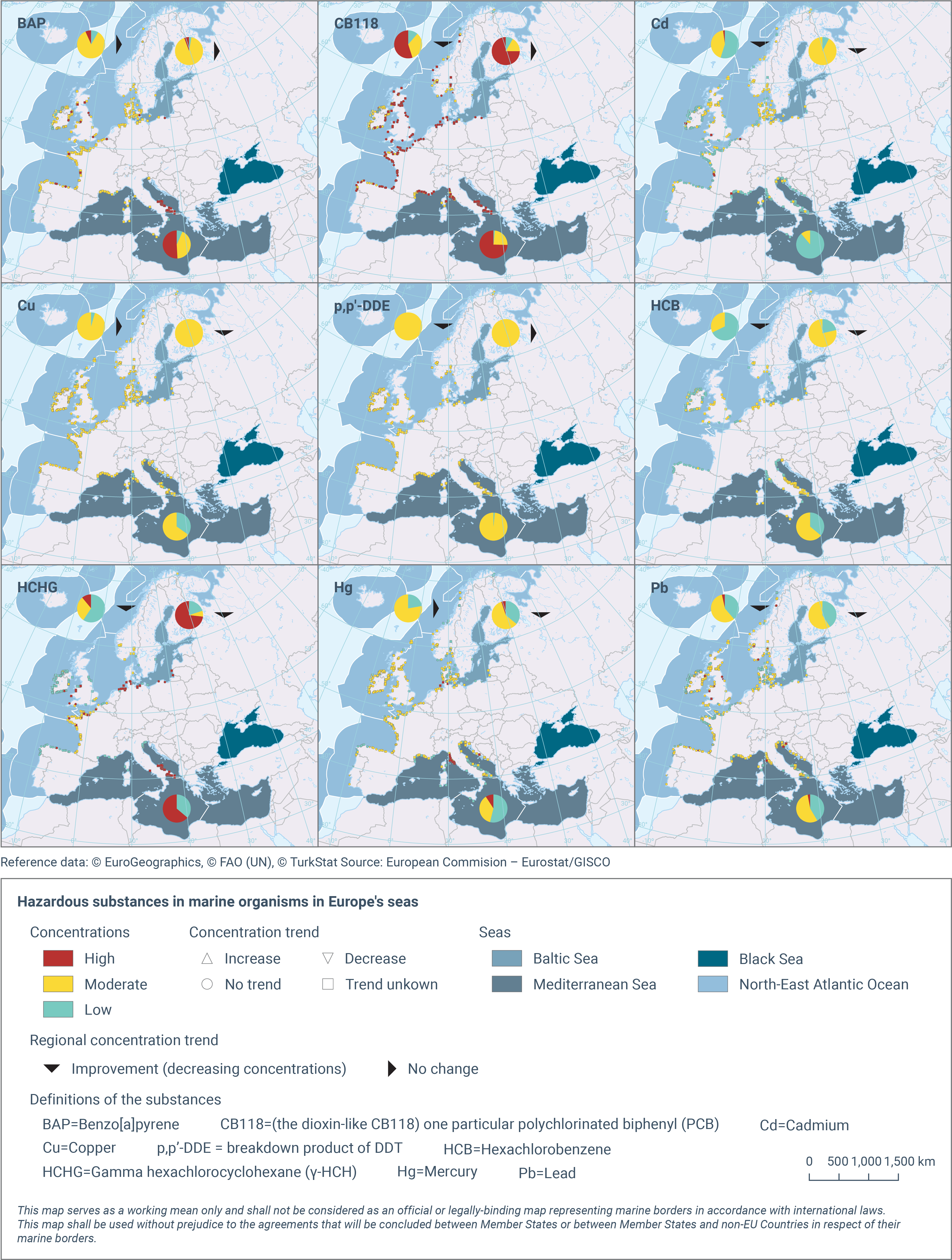
There is one map for each of the contaminants. In the map, each of the small dots represents a station (a location which is regularly monitored), coloured according to estimated concentration levels (low/moderate/high relative to environmental thresholds). The big pie diagrams show, for each region, the proportion of stations that have low/moderate/high concentration levels. The arrow by each pie diagram shows whether concentrations are in general increasing or show no significant change. There were no cases of decreasing trends.
Map-package.zip
Loading
