All official European Union website addresses are in the europa.eu domain.
See all EU institutions and bodies
An official website of the European Union | How do you know?
Environmental information systems
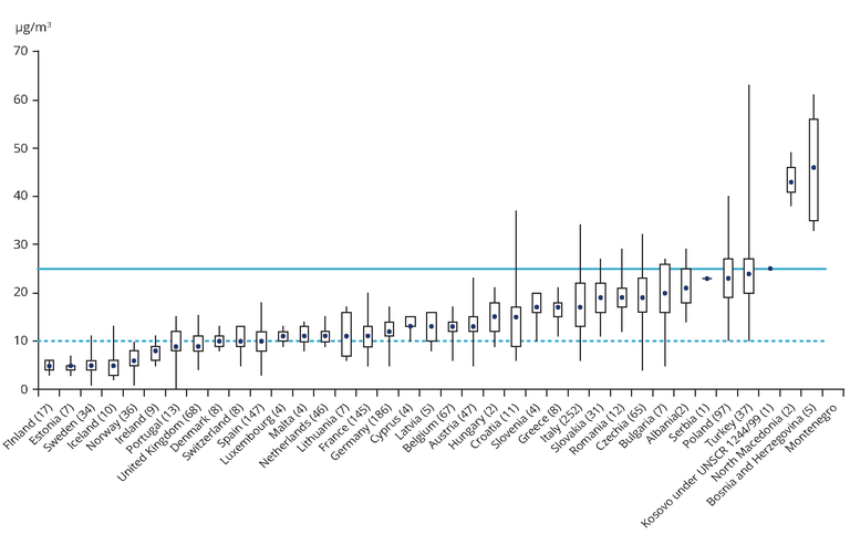
The graph is based on annual mean concentration PM2.5 values. For each country, together with the number of stations considered, the lowest, highest and median values (in µg/m3) recorded at its stations are given. The rectangles mark the 25th and 75th percentiles. At 25 % of the stations, levels are below the lower percentile; at 25 % of the stations, concentrations are above the upper percentile. The limit value set by EU legislation is marked by the upper horizontal line. The WHO AQG is marked by the lower horizontal line.
Loading