All official European Union website addresses are in the europa.eu domain.
See all EU institutions and bodies
An official website of the European Union | How do you know?
Environmental information systems
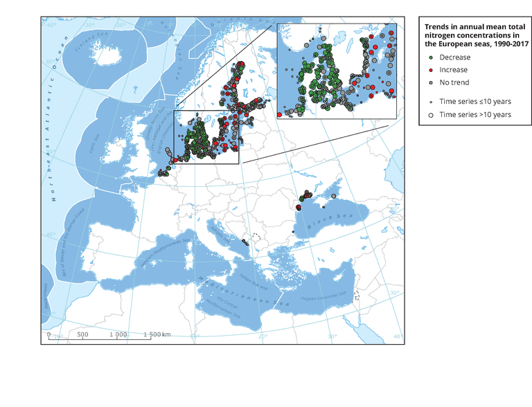
The map shows trends per station in total nitrogen concentrations in the upper 10 m of the water column, observed during the years 1990-2017.
Loading