All official European Union website addresses are in the europa.eu domain.
See all EU institutions and bodies
An official website of the European Union | How do you know?
Environmental information systems
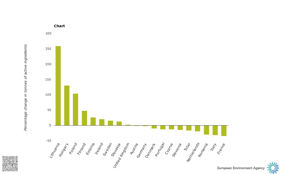
Bar graph showing net change in pesticide use per country (percentage change in tonnes of active ingredients)