All official European Union website addresses are in the europa.eu domain.
See all EU institutions and bodies
An official website of the European Union | How do you know?
Environmental information systems
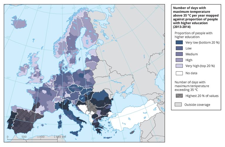
The map uses a colour gradient to show the percentage of working age population with higher education per NUTS2 region, classified in quantiles, against the highest exposure to high temperatures (top 20 % of number of days with maximum temperature exceeding 35 °C) represented as hatched areas.