All official European Union website addresses are in the europa.eu domain.
See all EU institutions and bodies
An official website of the European Union | How do you know?
Environmental information systems
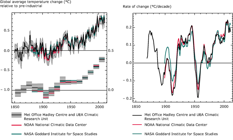
Left figure: Global average air temperature anomalies (1850 to 2011) in degrees Celsius (°C) relative to a pre-industrial baseline period for 3 analyses of observations: 1) Black line - HadCRUT3 from the UK Met Office Hadley Centre and University of East Anglia Climate Research Unit, baseline period 1850-1899 (Brohan et al., 2006) with the grey area representing the 95% confidence range, 2) Red line – MLOST from the US National Oceanic and Atmospheric Administration (NOAA) National Climatic Data Centre, baseline period 1880-1899 (Smith et al., 2008), and 3) Blue line - GISSTemp from the National Aeronautics and Space Administration (NASA) Goddard Institute for Space Studies, baseline period 1880-1899 (Hansen et al., 2010). Upper graph shows annual anomalies and lower graph shows decadal average anomalies for the same datasets.
Right figure: Rates of change of global average temperature (1850 to 2011) in ºC per decade, based on 10-year running average of the 3 datasets: 1) Black line - HadCRUT3 from the UK Met Office Hadley Centre and University of East Anglia Climate Research Unit, baseline period 1850-1899 (Brohan et al., 2006), 2) Red line – MLOST from the US National Oceanic and Atmospheric Administration (NOAA) National Climatic Data Centre, baseline period 1880-1899 (Smith et al., 2008), and 3) Blue line - GISSTemp from the National Aeronautics and Space Administration (NASA) Goddard Institute for Space Studies, baseline period 1880-1899 (Hansen et al., 2010).