All official European Union website addresses are in the europa.eu domain.
See all EU institutions and bodies
An official website of the European Union | How do you know?
Environmental information systems
EN

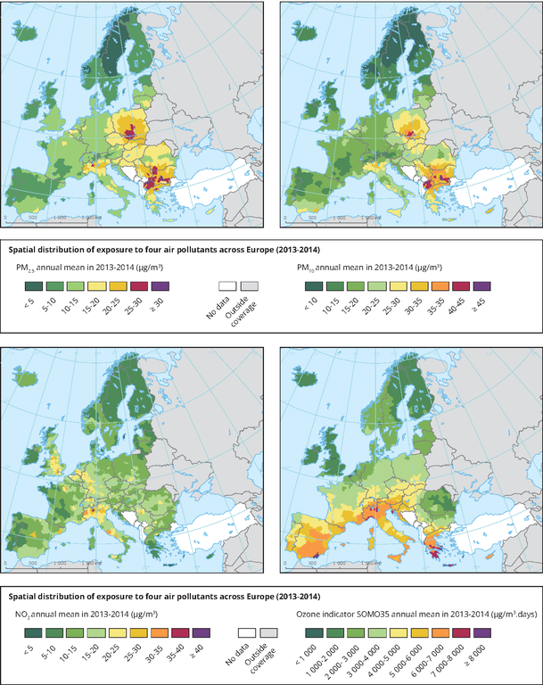
The maps use a colour gradient to show the population-weighted average PM2.5 (top left), PM10 (top right), NO2 (bottom left) and O3 (bottom right) concentrations (µg/m3) by NUTS 3 region, for the years 2013 and 2014. The colour scale varies from dark green representing low values, purple representing high values.
Loading