Observed and projected change in global mean sea level
Chart (static)
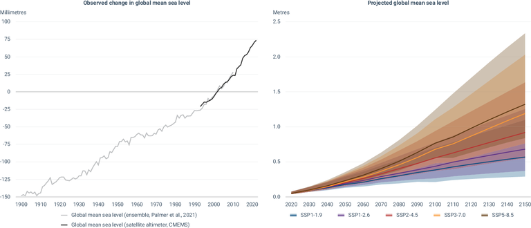
The left chart depicts the rise in global mean sea level from 1900 to 2022 based on two data sources. All values are relative to the average level of the period 1993-2010, during which the two datasets overlap. The grey line (Palmer et al., 2021) shows the ensemble sea-level reconstruction (using five members) of sea level anomalies during 1900-2010 (Palmer et al., 2021; https://iopscience.iop.org/article/10.1088/1748-9326/abdaec#erlabdaecs2). The dark grey line (CMEMS) shows the altimeter measurements corrected from the Topex-A drift at the beginning of the time series (Legeais et al., 2020), corrected for the GIA using the ICE5G-VM2 GIA model (Peltier, 2004), for the time series from 1993 to 2022.
The right chart shows global mean sea level projections under different Shared Socioeconomic Pathways (SSP) scenarios. Sea level projections considering only processes for which projections can be made with at least medium confidence are provided, relative to the period 1995-2014, for five SSP. The scenarios are described in sections TS1.3 and 1.6 and Cross-Chapter Box 1.4 of the Working Group 1 contribution. Sea level projections considering only processes for which projections can be made with at least medium confidence are provided, relative to the period 1995-2014, for five SSP. The scenarios are described in sections TS1.3 and 1.6 and Cross-Chapter Box 1.4 of the Working Group 1 contribution.
Downloads
Data sources
Metadata
More info
Loading
Global Ocean Mean Sea Level time series and trend from Observations Reprocessing
Global mean sea level projections
An ensemble approach to quantify global mean sea-level rise over the 20th century from tide gauge reconstructions (direct link to the datasets is not available)
Left chart: For Palmer et al., 2021, the data is the result of an ensemble approach to quantify historical global mean sea-level (GMSL) rise based on tide gauge reconstructions. The approach combines the maximum internal uncertainty across the ensemble with an estimate of structural uncertainty to provide a conservative estimate of the total uncertainty. Comparisons of GMSL rise over the 20th century based on deltas and linear trends (and their respective uncertainties) are consistent with past Intergovernmental Panel on Climate Change assessments and show good agreement with satellite altimeter timeseries. Sensitivity tests show that the estimates of GMSL rise are robust to the choice of reference period and central estimate timeseries. For the CMEMS data: Temporal evolution of globally averaged daily Mean Sea Level, as observed by satellites, without annual and semi-annual signals, corrected for the TOPEX-A instrumental drift (Ablain et al., 2017; WCRP Sea Level Budget Group, 2018), and corrected for the GIA using the ICE5G-VM2 GIA model (Peltier, 2004). 'Filtered' refers to 9-month low-pass filtered Mean Sea Level and anomalies are relative to the 1993-2010 mean.
Right chart:
As described in Cross-Chapter Box 1.4:
SSP1-1.9 holds warming to approximately 1.5°C above 1850-1900 in 2100 after slight overshoot (median) and implies net zero CO2 emissions around the middle of the century. SSP1-2.6 stays below 2.0°C warming relative to 1850-1900 (median) with implied net zero emissions in the second half of the century. SSP2-4.5 is approximately in line with the upper end of aggregate Nationally Determined Contribution emission levels by 2030. SR1.5 assessed temperature projections for NDCs to be between 2.7 and 3.4°C by 2100, corresponding to the upper half of projected warming under SSP2-4.5. New or updated NDCs by the end of 2020 did not significantly change the emissions projections up to 2030, although more countries adopted 2050 net zero targets in line with SSP1-1.9 or SSP1-2.6. The SSP2-4.5 scenario deviates mildly from a ‘no-additional-climate-policy’ reference scenario, resulting in a best-estimate warming around 2.7°C by the end of the 21st century relative to 1850-1900. SSP3-7.0 is a medium to high reference scenario resulting from no additional climate policy under the SSP3 socioeconomic development narrative. SSP3-7.0 has particularly high non-CO2 emissions, including high aerosols emissions. SSP5-8.5 is a high reference scenario with no additional climate policy. Emission levels as high as SSP5-8.5 are not obtained by Integrated Assessment Models (IAMs) under any of the SSPs other than the fossil fuelled SSP5 socioeconomic development pathway. Compared to 1850-1900, globally averaged surface air temperature over the period 2081-2100 is very likely (at least a 90% probability) to be higher by 1.0°C-1.8°C under SSP1-1.9, 1.3°C-2.4°C under SSP1-2.6, 2.1°C-3.5°C under SSP2-4.5, 2.8°C-4.6°C under SSP3-7.0, and 3.3°C-5.7°C under SSP5-8.5. In the sea level projections, likely ranges are assessed based upon the combination of uncertainty in the temperature change associated with an emissions scenarios and uncertainty in the relationships between temperature and drivers of projected sea-level change, such as thermal expansion, ocean dynamics, and glacier and ice sheet mass loss. In general, 17th-83rd percentile results are interpreted as likely ranges, reflecting the use of the term likely to refer to a probability of at least 66%.
To indicate the potential impact of deeply uncertain ice sheet processes, about which there is currently a low level of agreement and limited evidence, low confidence projections are also provided for SSP1-2.6 and SSP5-8.5. For both the Greenland and Antarctic ice sheets, the low confidence projections integrate information from the Structured Expert Judgement study of Bamber et al. (2019). For the Antarctic ice sheet, the low confidence projections also incorporate results from a simulation study that incorporates Marine Ice Cliff Instability (DeConto et al., 2021). The results shown are 17th-83rd percentile projections, but are not assessed as likely ranges because of the low agreement and limited evidence. See section 9.6 and Box 9.4 for more details.
For more information on the use of likelihood and confidence language by the Intergovernmental Panel on Climate Change, see Box 1.1.
Units
Left chart: millimetres Right chart: meters
Additional information
Left chart: anomalies are expressed relative to the 1993-2010 mean Right chart: IPCC AR6 Sea-Level Rise Projections
Temporal coverage Left chart: 1900-2022 Right chart: 2020-2150