All official European Union website addresses are in the europa.eu domain.
See all EU institutions and bodies
An official website of the European Union | How do you know?
Environmental information systems
EN

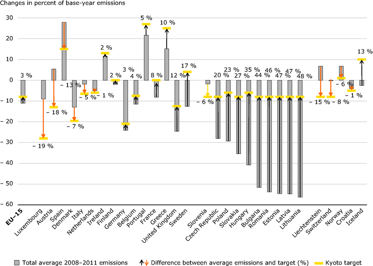
Each bar represents the percentage change of domestic emissions compared to base‑year emissions; the yellow line represents the Kyoto or burden-sharing target in relation to base‑year emissions. The numbers represent the gap between emissions and targets, expressed in percentage of base‑year emissions. A positive value (and black arrow pointing up) indicates that total emissions were lower than the Kyoto or burden-sharing target. A negative value (and orange arrow pointing down) indicates that total emissions were higher than the Kyoto or burden-sharing target.
For Liechtenstein, Croatia and Iceland, the comparison is based on average total 2008–2010 emissions, due to the unavailability of approximated 2011 GHG emission estimates.
Loading