All official European Union website addresses are in the europa.eu domain.
See all EU institutions and bodies
An official website of the European Union | How do you know?
Environmental information systems
EN

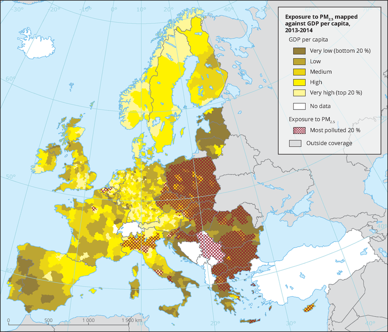
The map uses a colour gradient to show the GDP per capita per NUTS3 region, classified in quantiles against the highest exposure to PM2.5 pollution represented as hatched areas (only the top 20 % of PM2.5 are shown).
Loading