All official European Union website addresses are in the europa.eu domain.
See all EU institutions and bodies
An official website of the European Union | How do you know?
Environmental information systems
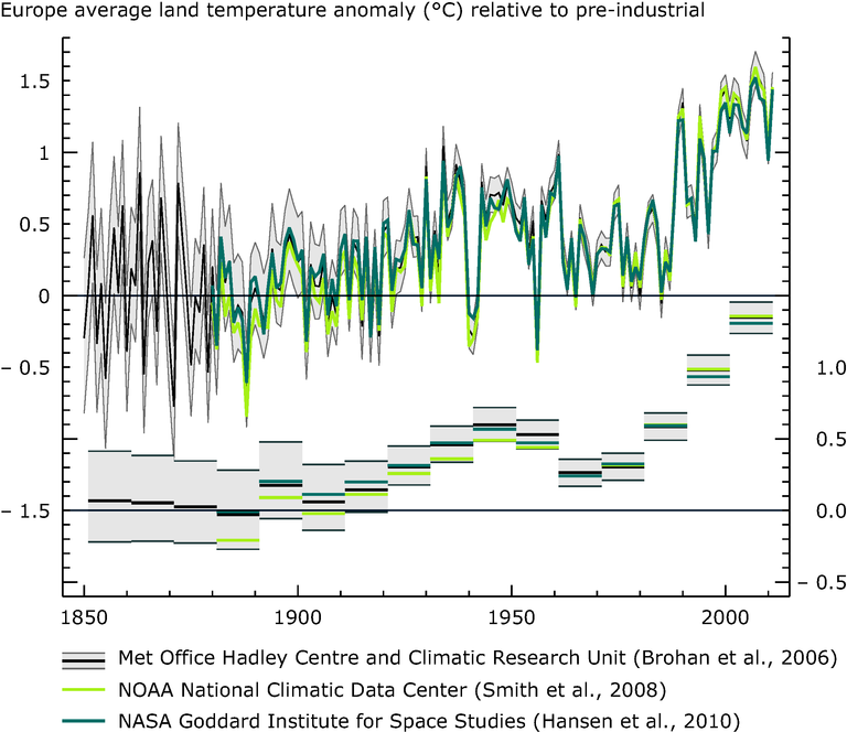
The upper graph and left axis show annual anomalies and the lower graph and the right axis show decadal average anomalies for the same datasets. The figure compares three analyses of observations.
The black line refers to data from HadCRUT3 from the UK Met Office Hadley Centre and University of East Anglia Climate Research Unit, baseline period 1850–1899 (Brohan et al., 2006).
The green line refers to data from GHCN-M version 3.1.0 from the US National Oceanic and Atmospheric Administration (NOAA) National Climatic Data Centre, baseline period 1880–1899 (Smith et al., 2008).
The blue line refers to data from GISSTemp from the National Aeronautics and Space Administration (NASA) Goddard Institute for Space Studies, baseline period 1880–1899
Loading