All official European Union website addresses are in the europa.eu domain.
See all EU institutions and bodies
An official website of the European Union | How do you know?
Environmental information systems
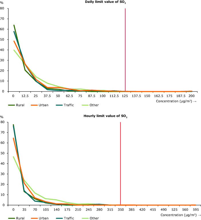
The graphs show the percentage frequency distribution of stations (on the y-axis) in the EU Member States versus the various concentration classes (on the x-axis, in µg/m3). Vertical lines correspond to the limit values set by the EU legislation.
Loading