All official European Union website addresses are in the europa.eu domain.
See all EU institutions and bodies
An official website of the European Union | How do you know?
Environmental information systems
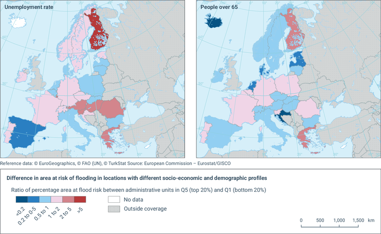
Left: This map presents, at EU-27 member state level for 2020, the ratio of the average (mean) percentage of area potentially exposed to flooding between administrative units containing population with the highest unemployment rate (top 20% or 5th quintile) and the administrative units containing population with the lowest unemployment rate (bottom 20% or 1st quintile) in a given country.
Right: This map presents, at EU-27 member state level for 2020, the ratio of the average (mean) percentage of area potentially exposed to flooding between administrative units containing population with the highest percentage of people over 65 years old (top 20% or 5th quintile) and the administrative units containing population with the lowest proportion of people over 65 years old (bottom 20% or 1st quintile) in a given country.
Loading