All official European Union website addresses are in the europa.eu domain.
See all EU institutions and bodies
An official website of the European Union | How do you know?
Environmental information systems
EN

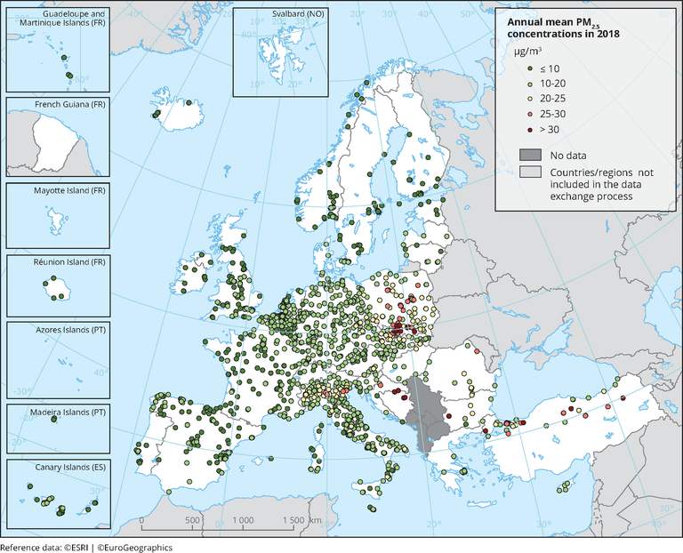
Observed concentrations of PM2.5 in 2018. The possibility of subtracting contributions to the measured concentrations from natural sources and winter road sanding/salting has not been considered. Dots in the last two colour categories indicate stations reporting concentrations above the EU annual limit value (25 μg/m3). Dots in the first colour category indicate stations reporting values below the WHO AQG for PM2.5 (10 μg/m3). Only stations with more than 75 % of valid data have been included in the map.
Loading