All official European Union website addresses are in the europa.eu domain.
See all EU institutions and bodies
An official website of the European Union | How do you know?
Environmental information systems
EN

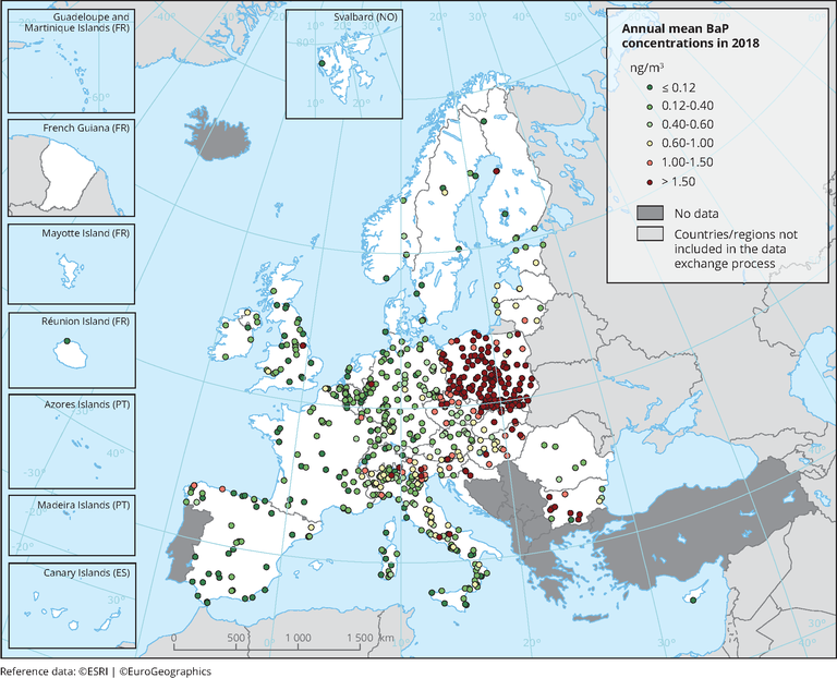
Observed concentrations of BaP in 2018. Dots in the first colour category correspond to concentrations under the estimated RL (0.12 ng/m3). Dots in the last colour category correspond to concentrations exceeding the 2004 Ambient Air Quality Directive target value of 1 ng/m3.
Only stations reporting more than 14 % of valid data, as daily, weekly or monthly measurements, have been included in the map.
Loading