The arrows show the observed trend in sea level relative to land since 1970 for those tide gauges along the Europe coastline with sufficiently long time series (mm/year). Projections: European sea level change for 2081–2100 for SSP5-8.5 in metres. Results use CMIP6 model projections for long term scenario (2081-2100), for SSP5-8.5, and with respect to a baseline of 1995-2014.

The left chart depicts the rise in global mean sea level from 1900 to 2022 based on two data sources. All values are relative to the average level of the period 1993-2010, during which the two datasets overlap.
The grey line (Palmer et al., 2021) shows the ensemble sea-level reconstruction (using five members) of sea level anomalies during 1900-2010 (Palmer et al., 2021; https://iopscience.iop.org/article/10.1088/1748-9326/abdaec#erlabdaecs2).
The dark grey line (CMEMS) shows the altimeter measurements corrected from the Topex-A drift at the beginning of the time series (Legeais et al., 2020), corrected for the GIA using the ICE5G-VM2 GIA model (Peltier, 2004), for the time series from 1993 to 2022.
The right chart shows global mean sea level projections under different Shared Socioeconomic Pathways (SSP) scenarios. Sea level projections considering only processes for which projections can be made with at least medium confidence are provided, relative to the period 1995-2014, for five SSP. The scenarios are described in sections TS1.3 and 1.6 and Cross-Chapter Box 1.4 of the Working Group 1 contribution. Sea level projections considering only processes for which projections can be made with at least medium confidence are provided, relative to the period 1995-2014, for five SSP. The scenarios are described in sections TS1.3 and 1.6 and Cross-Chapter Box 1.4 of the Working Group 1 contribution.

Maximum extent of ice cover in the Baltic Sea in the winters 1719/20-2022/23 (green bars) and 15 year moving average (blue line). Source: Jouni Vainio, Finnish Meteorological Institute (updated from Seinä and Palosuo 1996; Seinä et al. 2001).

This figure combines two data sources.
The left part shows the observed change in Arctic sea ice are (individual observations and trend lines) over the period 1979 to 2023 for March (maximum ice cover) and September (minimum ice cover).
The right part shows projections of Arctic sea ice area in March and September from CMIP6 (Coupled Model Intercomparison Project Phase 6) simulations for three emissions scenarios. The thick lines denote the multimodel ensemble mean (24-27 models, depending on the scenario), and the shading shows the likely uncertainty interval (one standard deviation around the multimodel mean). The dashed line indicates a threshold for near ice-free conditions.

The figure shows the percentage point variations in the share of buses, trains, trams and metro (collective modes) and of inland waterways and trains (non-road modes) in total inland passenger and freight transport activities respectively by country.

The figure shows the share of buses, trains, trams and metro (collective modes) and of inland waterways and trains (non-road modes) in total inland passenger and freight transport activities respectively in the EU-27. For reference, the absolute activities in the EU-27 for passenger and freight transport have been included.

The figure shows the relative magnitude of emissions of pollutants from transport in EU-27 compared to 1990.

The figure shows EU-27 variations for the 1990-2021 period in the emissions of different categories of pollutants from transport by mode.

Recycling rates of municipal and packaging waste relate to waste generated. Recycling of municipal waste includes material recycling and composting/anaerobic digestion. Recycling rates of waste excluding major mineral wastes relate to waste treated. Recycling rates for waste electrical and electronic equipment (WEEE) are calculated on the basis of the average quantity of electrical and electronic equipment (EEE) put on the market in the three previous years.

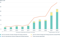
This figure presents the trends in the volume and the share of the use of EU Emissions Trading System (ETS) auctioning revenues by categories of spending.

This figure shows the trends in nitratre concentrations in European rivers and groundwater and the trends in phosphorus in European lakes and rivers

This figure shows the trends in biochemical oxygen demand (BOD) and ammonium in European rivers.