This graph shows the progress of the hydrofluorocarbon (HFC) phase-down under EU regulation. HFC, hydrofluorocarbon; POM, placing on the market; RACHP, refrigeration, air conditioning and heat pump.
Data shown for 2022 are preliminary and subject to further validation by the European Commission. Values from 2007 to 2013 are based on the reporting obligations of the old F-gas Regulation (EC) No 842/2006 and are therefore not fully comparable with data from 2014 onwards (based on the obligations of the current F-gas Regulation (EU) No 517/2014).
The maximum quantities of the EU HFC phase-down shown for 2015-2019 apply to EU-28, for 2020 to EU-27 and UK. EU-27 maximum quantities for 2021 onwards have been recalculated to reflect the effects of Brexit.

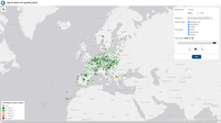
Latest measurements from Europe's air quality monitoring network

This chart reports the number of newly registered electric cars (battery electric vehicles (BEV) and plug-in hybrid electric vehicles (PHEV)) in the EU-27 and non-EU EEA countries (i.e. Iceland, Norway and Switzerland)

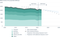
This figure shows the EU-27 Effort Sharing emissions as well as the Member States' projections covering emissions under the Effort Sharing Regulation ('with existing measures' (WEM) and 'with additional measures' (WAM) scenarios).

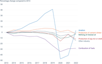
This figure shows change in greenhouse gas emissions under the European Union Emissions Trading System since 2013 by industry type.

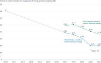
The EU has not succeeded in meeting its target to reduce, by 2020, the greenhouse gas emission intensity of fuels sold for road transport to 6% below 2010 levels. Between 2010 and 2020, the emission intensity decreased by 5.5%, mostly due to the increased use of biofuels. Eleven countries have succeeded in decreasing their emission intensities by more than 6%. If Indirect Land Use Change (ILUC) effects of biofuel production are considered, the emission intensity of fuels sold in the EU decreased slightly between 2019 and 2020.

In 2020, eleven countries succeeded in decreasing their emission intensities by more than 6%, with Sweden and Finland achieving the highest reductions (19.1% and 7.2% respectively).

This figure shows the EU-27 greenhouse gas emission targets, historical and future emission trends of emissions covered by the Effort Sharing legislation, the EU Emission Trading System (ETS) and the Land Use, Land Use Change, and Forestry sector (LULUCF).