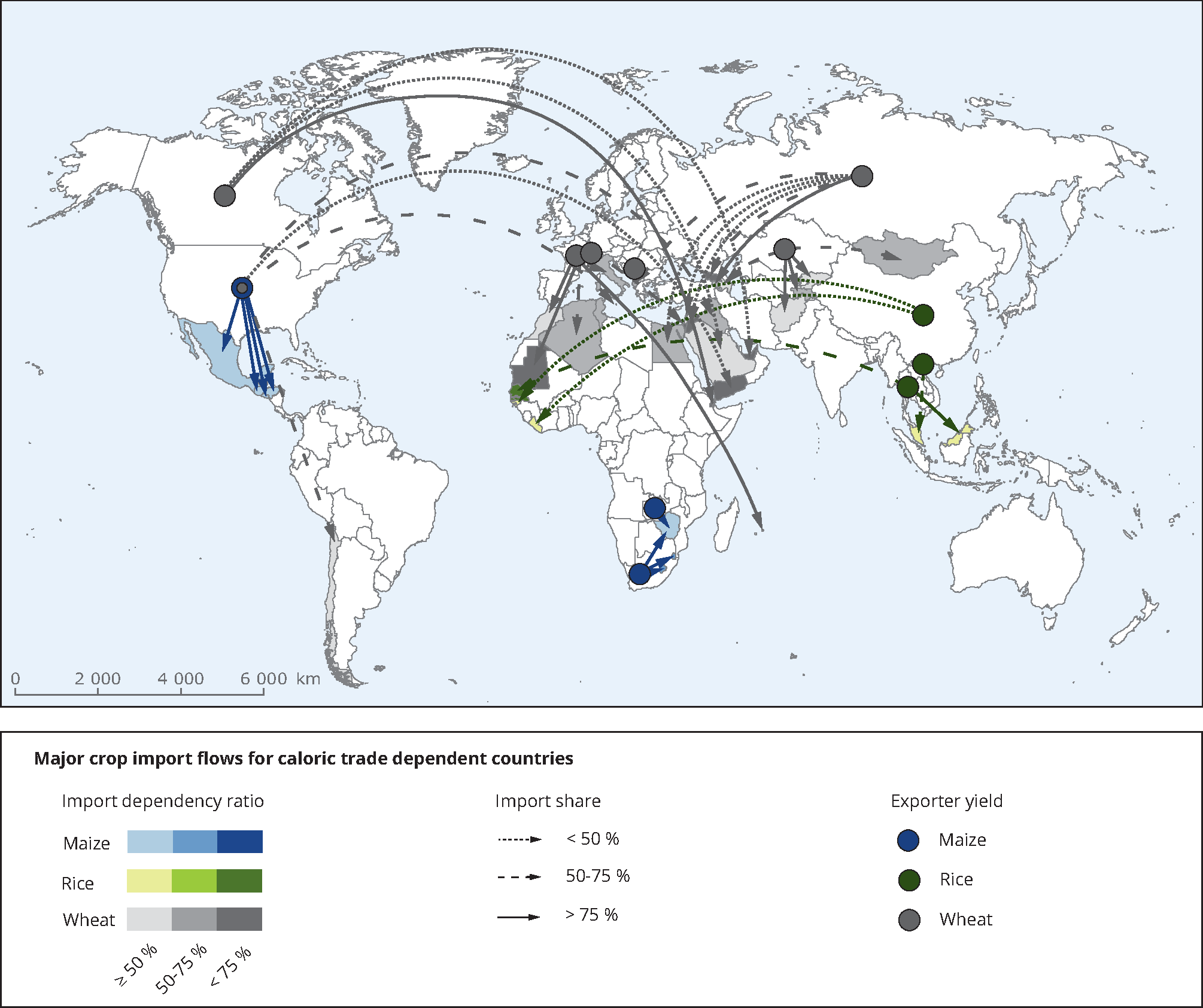
We use data from FAOSTAT when available. In case of missing data, we take data from GTAP. For some of the countries in question, GTAP 8.1 provides export data only on an aggregate level (as e.g. Rest of Western Africa). Further, maize is not a separate sector but part of the sector group Other Grains that also comprises barley, rye, oats and other cereals. Further, GTAP holds data for the year 2007 only whereas the information derived from FAO represents five-year averages (2007-2011). Source: FAOSTAT Food Balance Sheets and GTAP.
Geographical coverage: Geographical regions
Copyright policy for this illustration: Original content from this work may be used under the terms of the Creative Commons Attribution 3.0 licence. Any further distribution of this work must maintain attribution to the author(s) and the title of the work, journal citation and DOI.


Document Actions
Share with others